Leibinger – Relaunch Portfolio
Core Range, "Bierbuckel" and "Seeweisse"


The Heimatbrauerei Leibinger from Ravensburg was founded in 1894 by Max Leibinger I and has been run as a successful family business ever since. Over the past 1.5 years, Heimatbrauerei has been transforming its regional product range piece by piece. A new, handcrafted, high-quality look across the entire portfolio is emerging. Consumers are going along with the bold step of renewal and are enthusiastic.
Leibinger Core-Range Relaunch: Homeland solidarity nobly staged
The beers of Heimatbrauerei Leibinger have always stood for the sophisticated and traditional art of brewing. The use of the best regional ingredients is an expression of the Leibinger brewery family's high quality consciousness and its close ties to its homeland. The aim of the relaunch of the brewery's core range was to make this self-image tangible in the design of the beers.
Core elements such as the logo including the coat of arms and the rhombus were reinterpreted and charged with warmth and regional character. Carefully designed and coordinated details underscore the high quality of Leibinger beers. The use of matte uncoated paper and sparing finishes in gold round off the handcrafted, traditional look in a contemporary way.
Leibinger Seeweisse relaunch: focused - artisanal - authentic
In the course of the Leibinger Seeweisse relaunch, the label design and the label shape were comprehensively revised: As with the relaunch of Leibinger Edel, Pils and non-alcoholic beers, the familiar diamond shape was taken up as a basic element of the design and reinterpreted in a straight-lined, embossed manner. In addition to the neck ribbon, it offers plenty of room for clear differentiation between the different types, with a modified color spectrum based on the original design.
The photorealistic image of the sailboat on the lake has been replaced by an illustration that has been greatly reduced in its details. The Seeweisse brand is given a new visual focus with the sailboat. The Seeweisse lettering was retained and adjusted in color, and light and shadow effects were removed in favor of clarity. The sailboat and the lettering thus form a strong word-image brand in the new design and the prominent center of the design. Associations with the beautiful Lake Constance are awakened and the recognition of the brand family is significantly increased. The reduced style of the new design in combination with the matt, slightly structured uncoated paper give the Leibinger Seeweisse range a qualitative look - tradition and regional craftsmanship are given a contemporary and self-confident design.
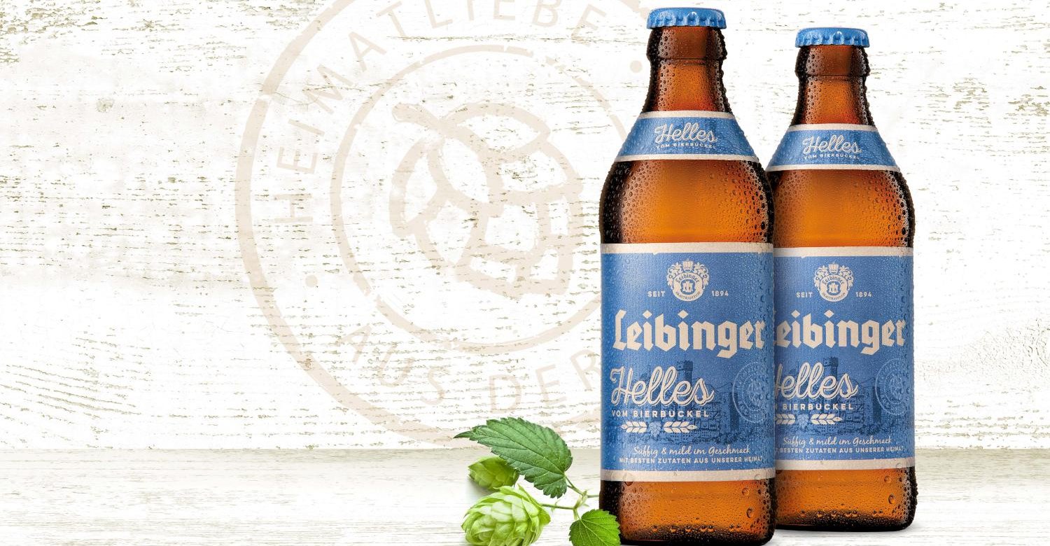
Helles vom Bierbuckel launch: tradition made tangible
With the launch of "Helles vom Bierbuckel," the brewery is adding a popular trend product to its range. The product is aimed in particular at the tastes of young consumers and at the same time appeals to loyal customers who appreciate the traditional beers of the Leibinger Brewery. The name created especially for the innovation supports the design concept with a clear reference to the brewery's location. The reduced color design on matt uncoated paper lends naturalness and warmth. It underscores the craft character of the beer and the Leibinger family's ties to their homeland.