Wollbrink – Relaunch Portfolio
Design relaunch and shape launch for the classic liqueur
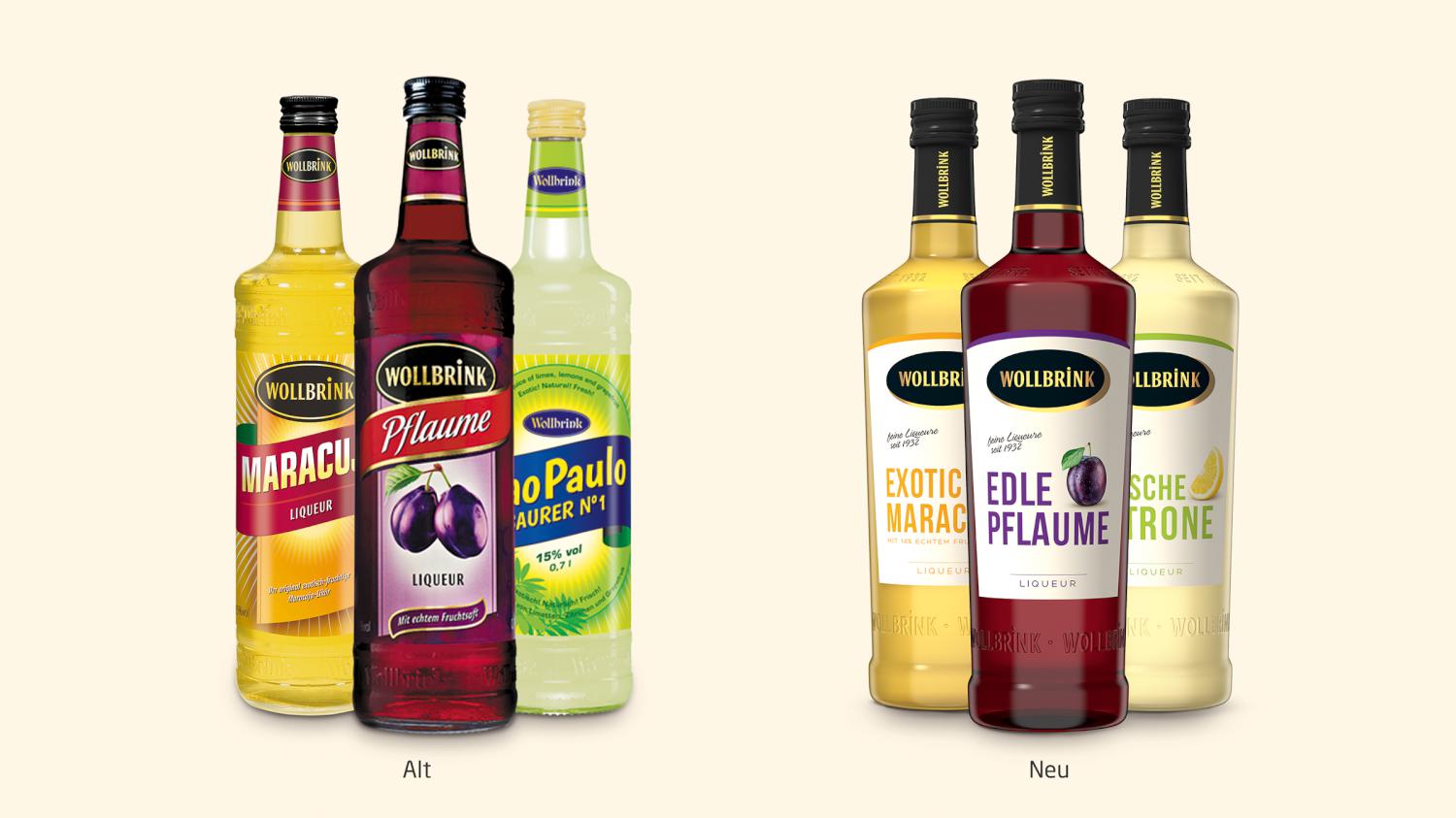
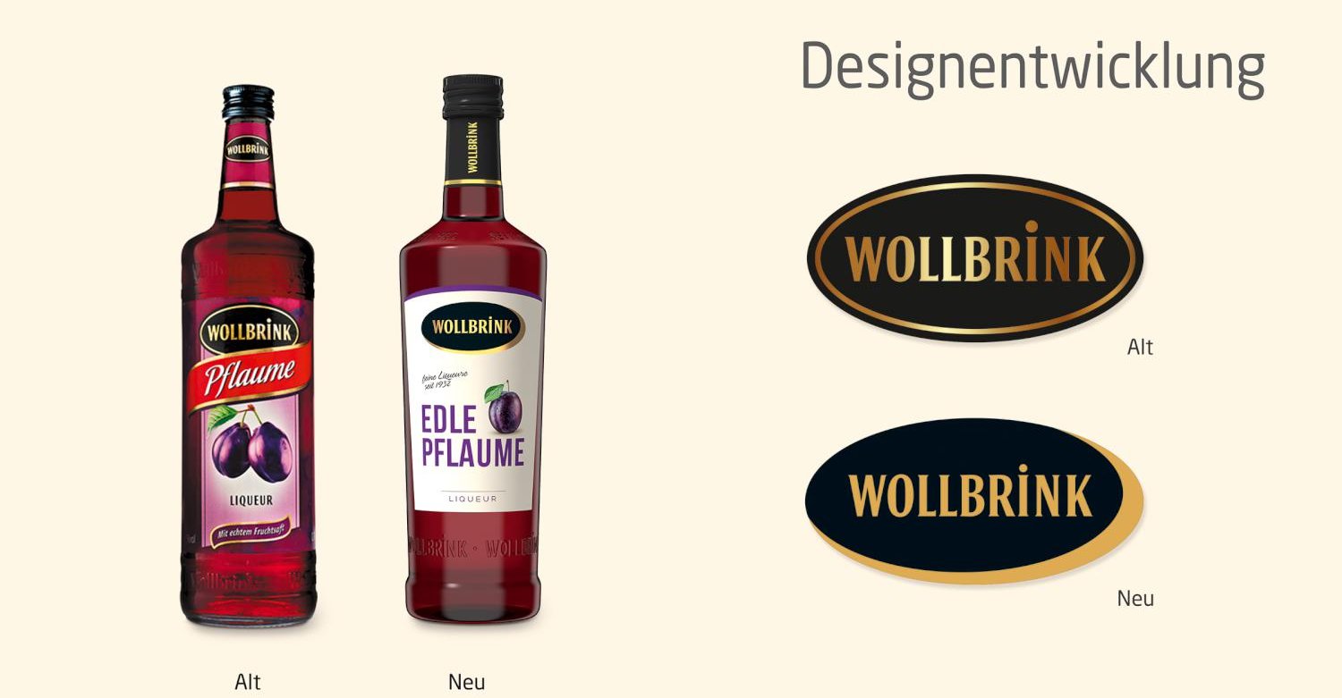
The liqueur classic Wollbrink from 1932 received a comprehensive relaunch of the label design. For a coherent and contemporary appearance of the brand, a new bottle shape was also designed and implemented in the course of this.
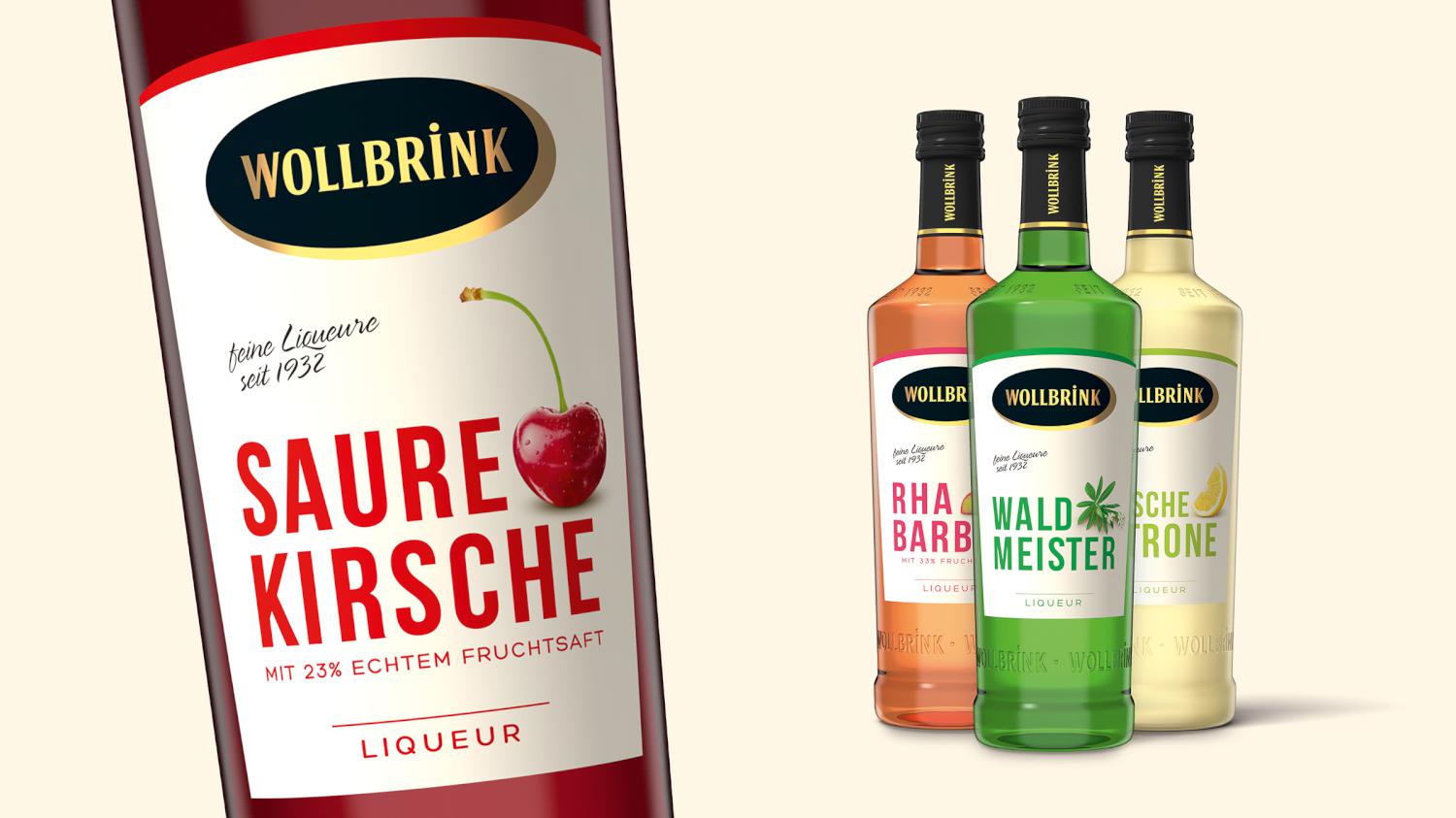
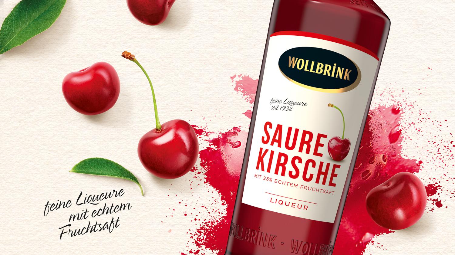
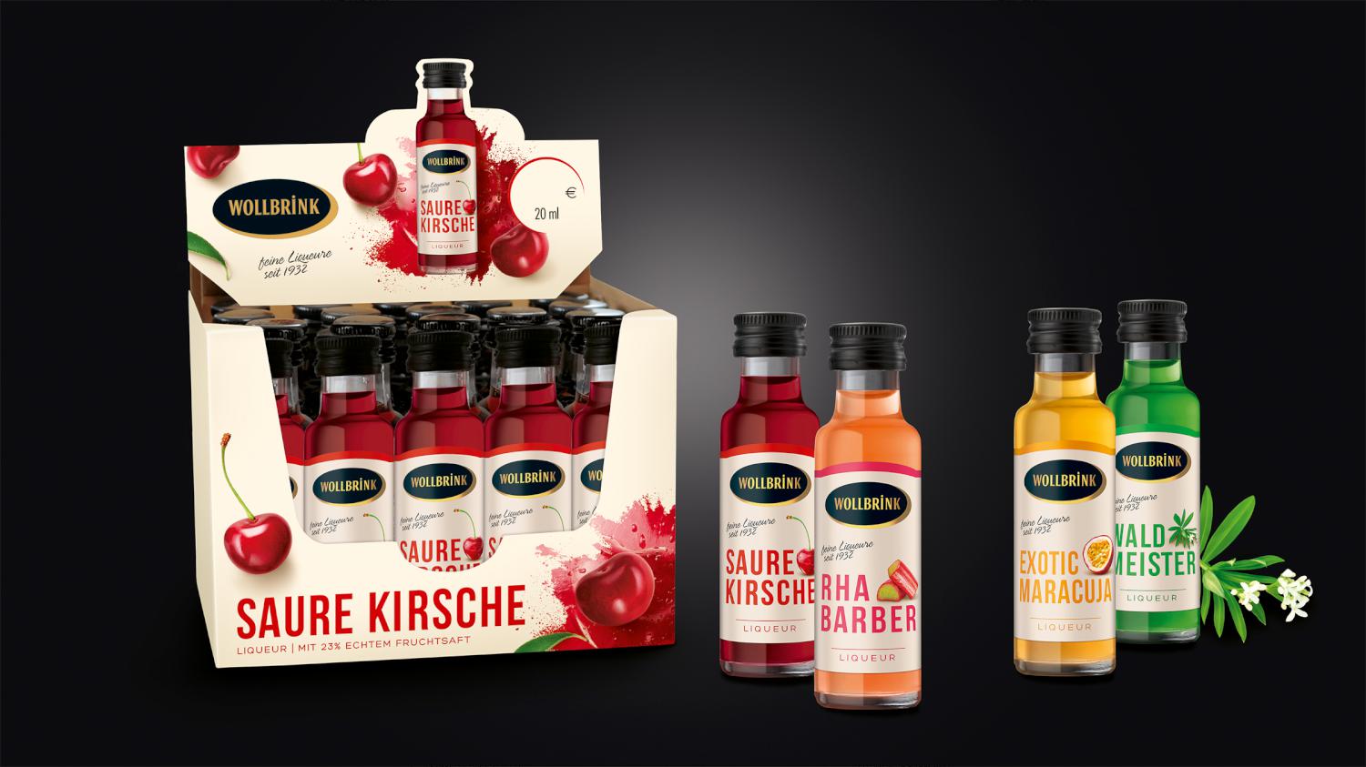
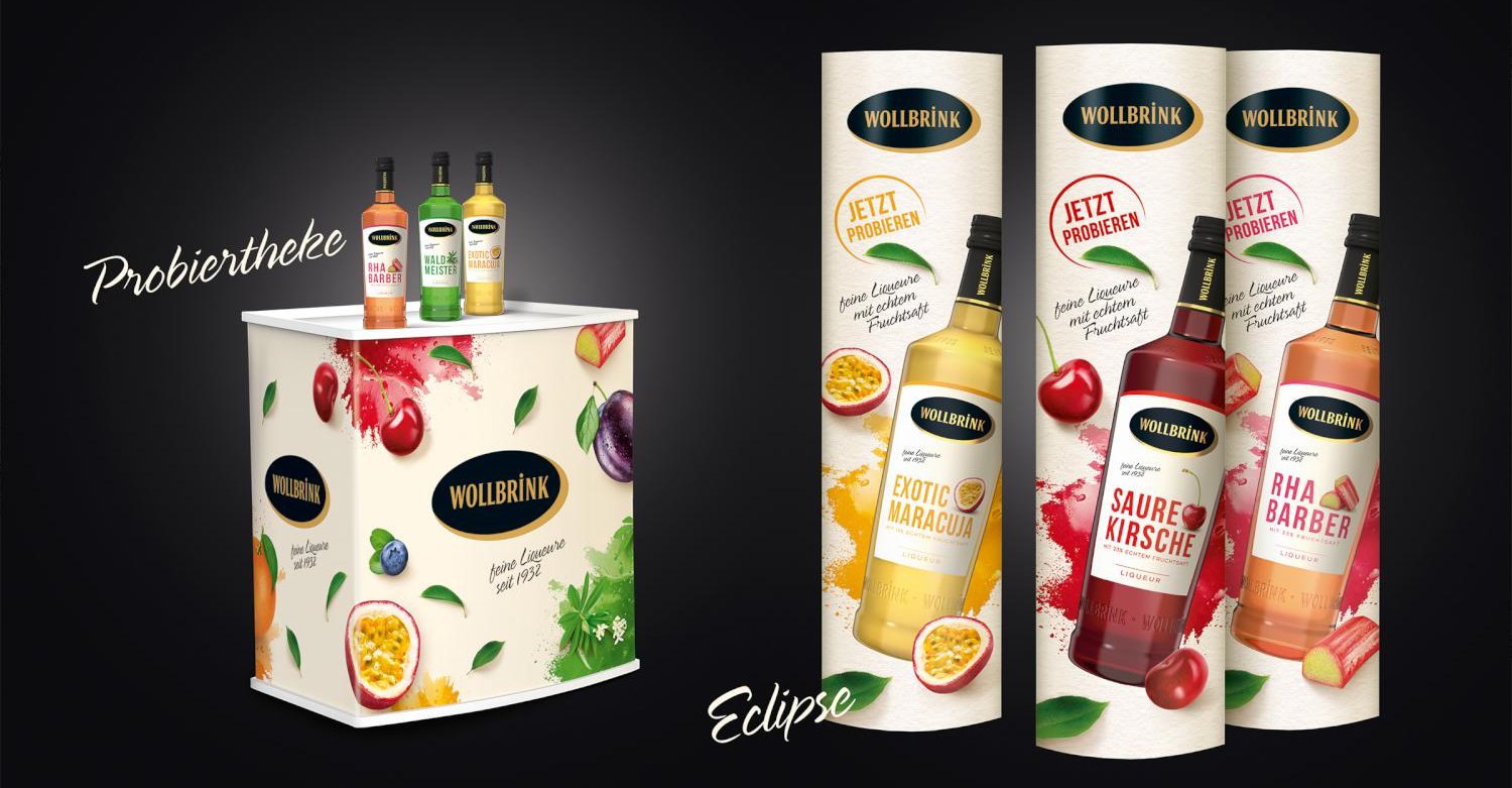
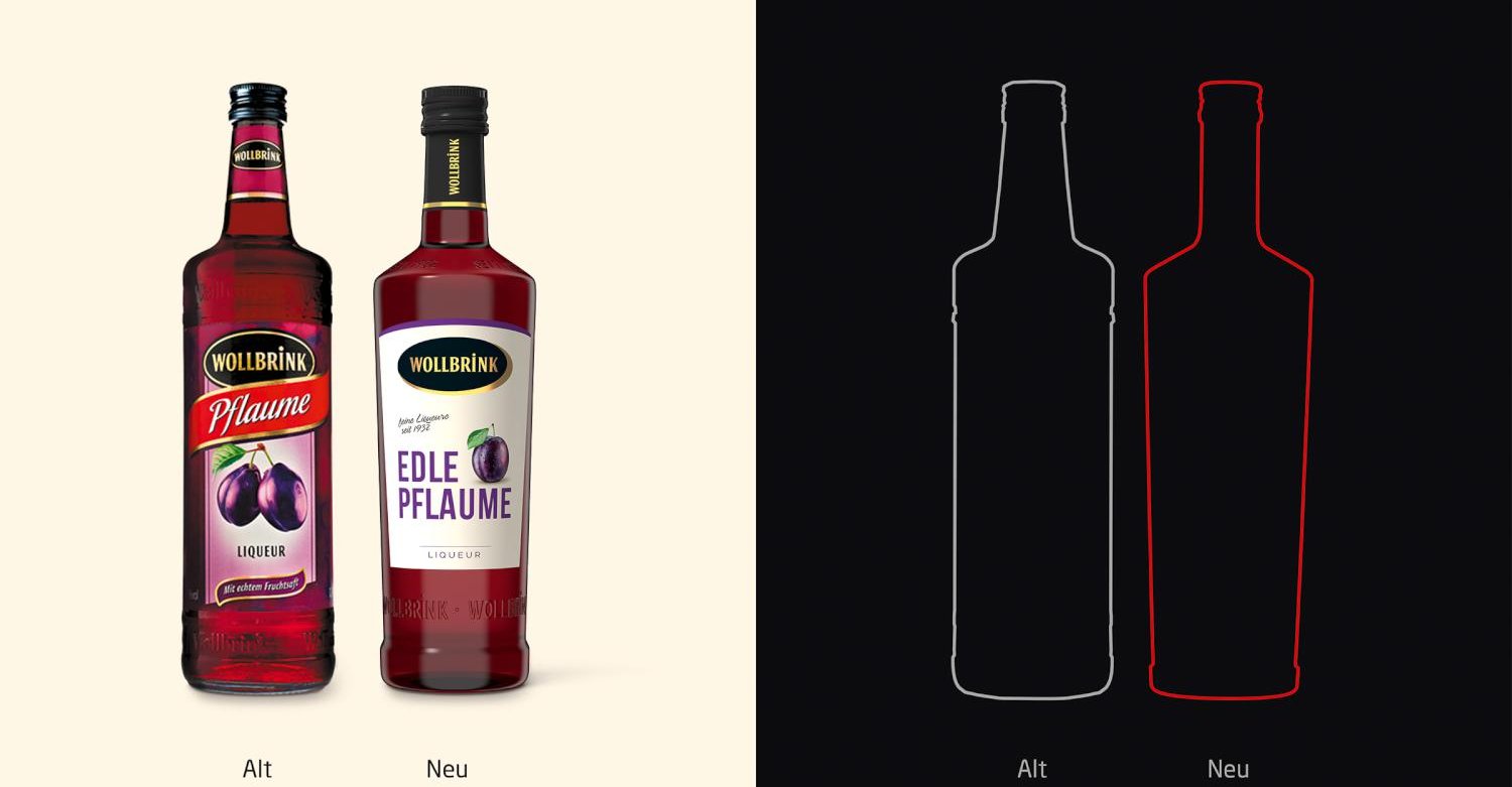
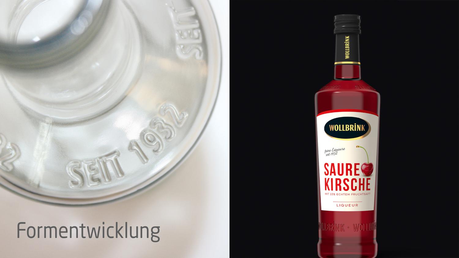
The design relaunch: the 9 fruit liqueurs, ranging from sour cherry to woodruff, now appear under an overarching, newly created brand image. The two different ranges of the brand have been consistently merged. The new design climate of the range is clear, fresh and high-quality/classic-modern.
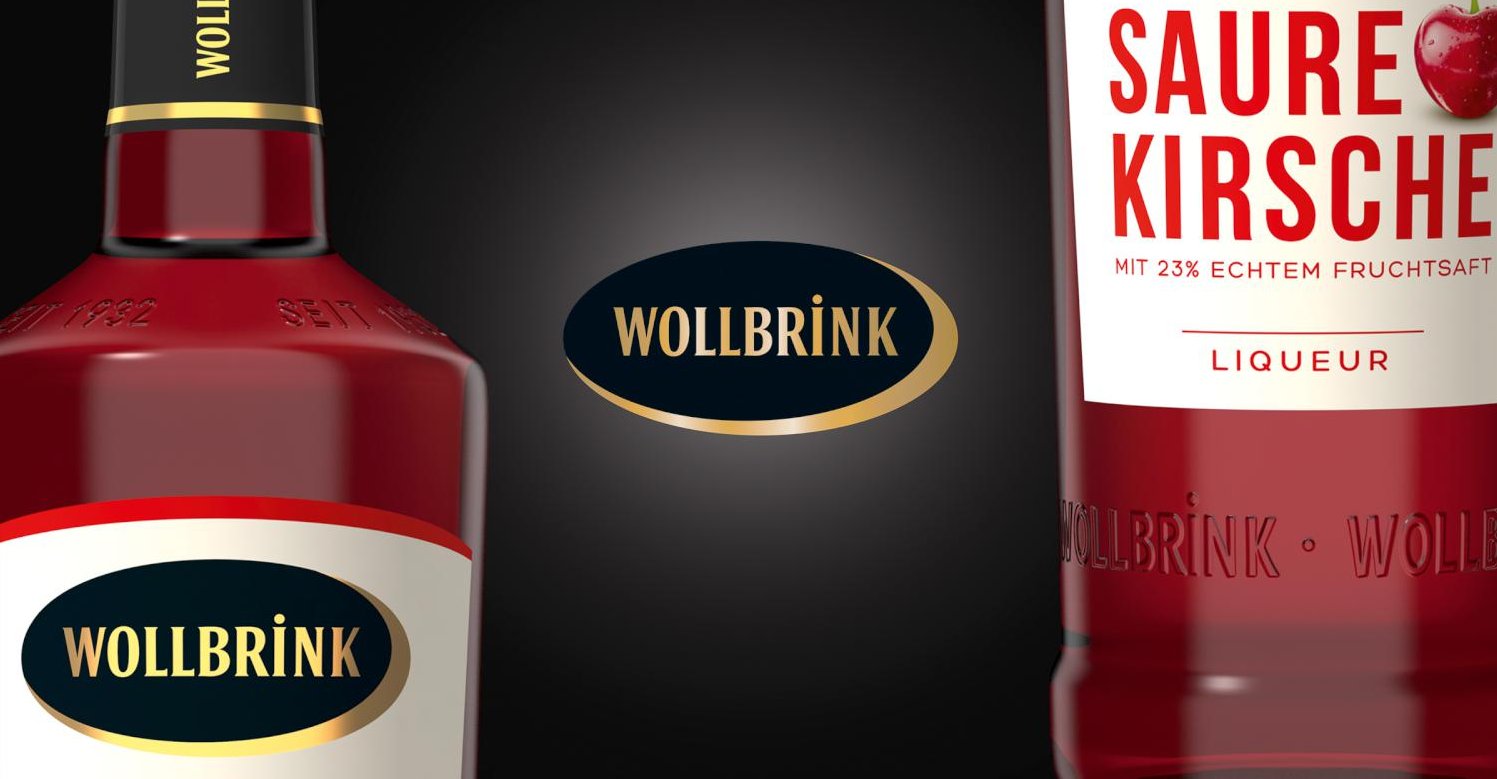
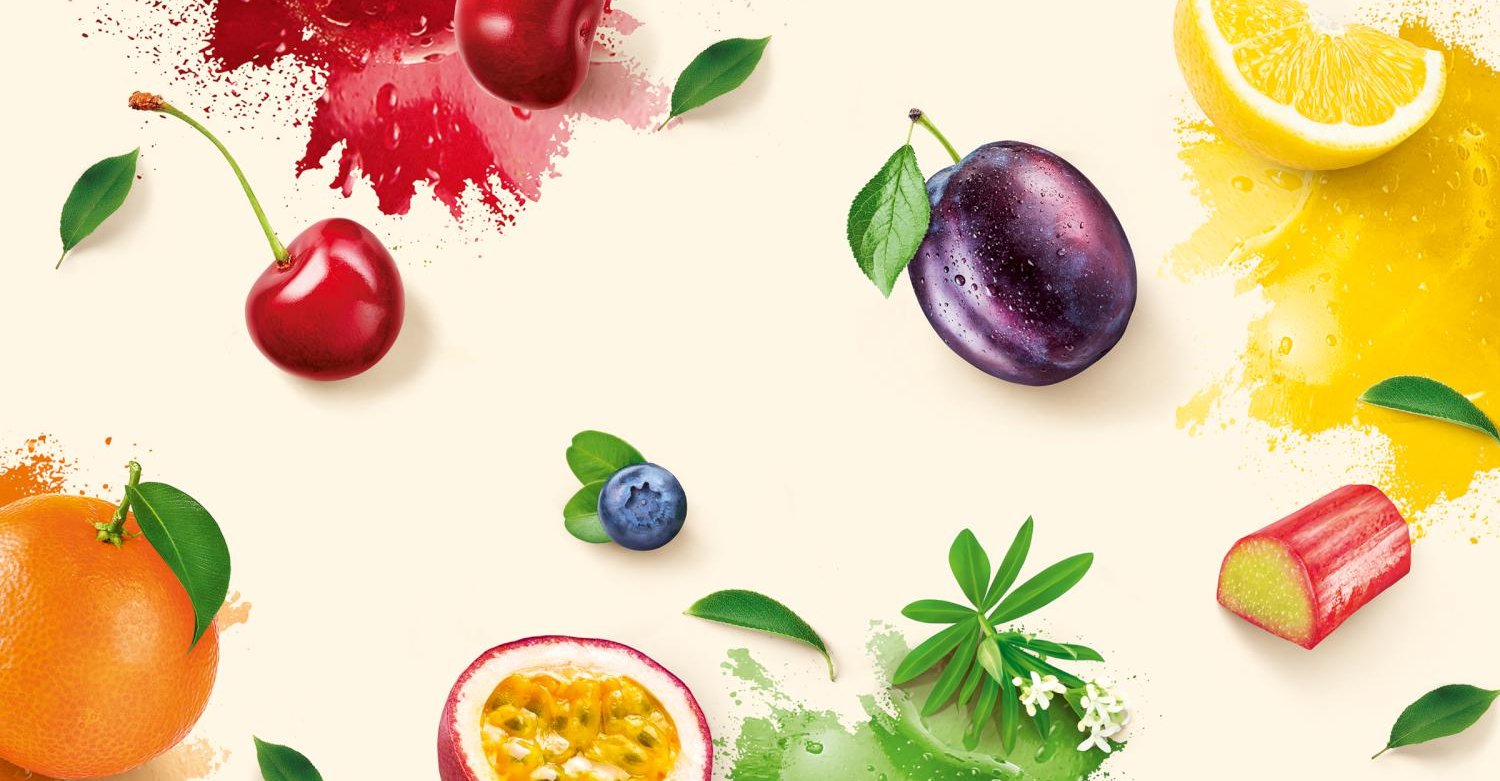
The design stages the fruit as a hero, therefore moving it into the focus of the label design. The design of the typography range in interaction with the fruit forms a color-changing word-image composition per liqueur. The Wollbrink brand logo has been gently optimized and is thereby absolutely recognizable. An aesthetic, black long-cap bundles the range in cool black.
The shape launch: The pure and clean look of the new range design is supported by a newly created, unique bottle shape. The stretched bottle neck and the angular, confident shoulders define the lines of the bottle shape.
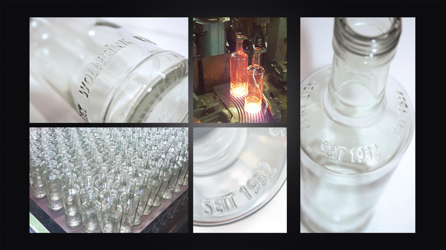
The Wollbrink brand and the year this classic was created have been stamped into the new shape, complete the new qualtitative look. A real upgrade of the brand.
