Boehringer – Frubiase Sport
Dynamic evolution
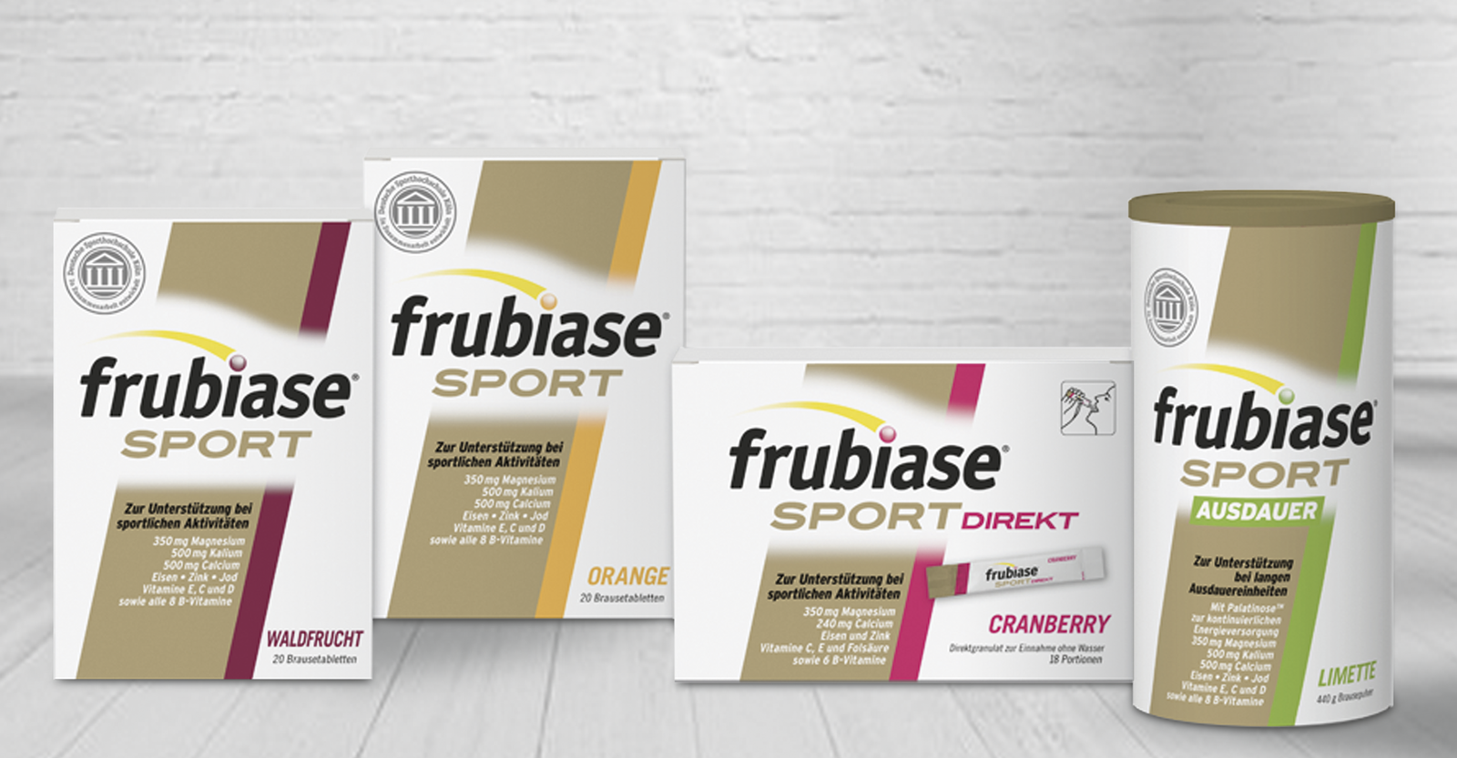
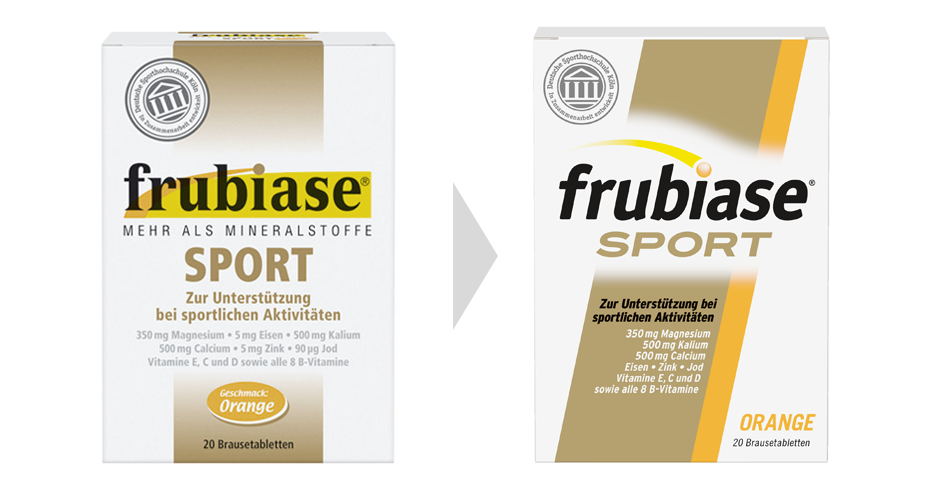
The family-owned company 'Boehringer Ingelheim' is one of the largest and most successful pharmaceutical companies in Germany and sells a well-established range of products in German pharmacies. In spring 2012, the 'Frubiase' products were relaunched to strengthen the brand's high level of competence and make the design more contemporary and - appropriate to the target group - more 'sporty'. At the same time, recognition was to be ensured for the regular customers.
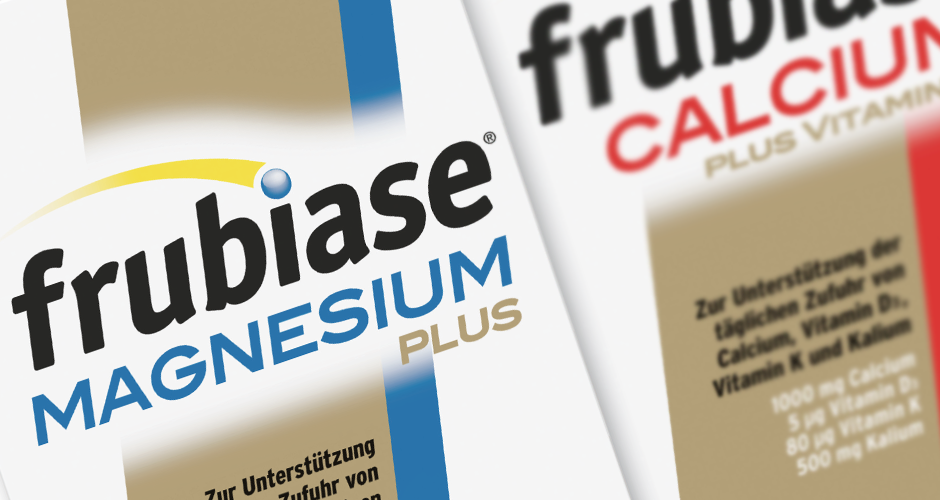
The evolutionary development of the packaging design draws on existing elements. The modern, reduced logo as well as the increased dynamics of the typo and the gold bar give the product more sportiness. The optimized information hierarchy and variety differentiation help the user to make quick decisions at the shelf.
