OmniVision – Fermavisc® Relaunch
A feast for the eyes for the whole of Switzerland
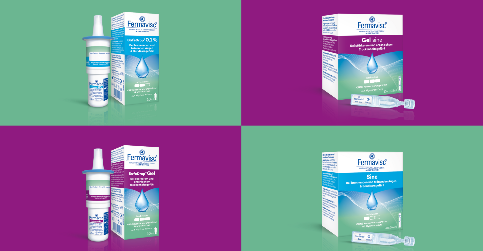
After the successful relaunch of the Hylo-Vision® brand in Germany, the Omnivision company also wanted to revise the aging design of the Swiss brand Fermavisc. The particular challenges here were dealing with the distinctive but not quite easy-to-use shade of green, maintaining and strengthening brand recognition, transferring the blue iris to the new packaging design, and placing the three languages, including new claims, in a clear and meaningful way. Very early on, however, it was decided to adapt the design structure of Hylo-Vision® in order to build recognition as a sender brand.
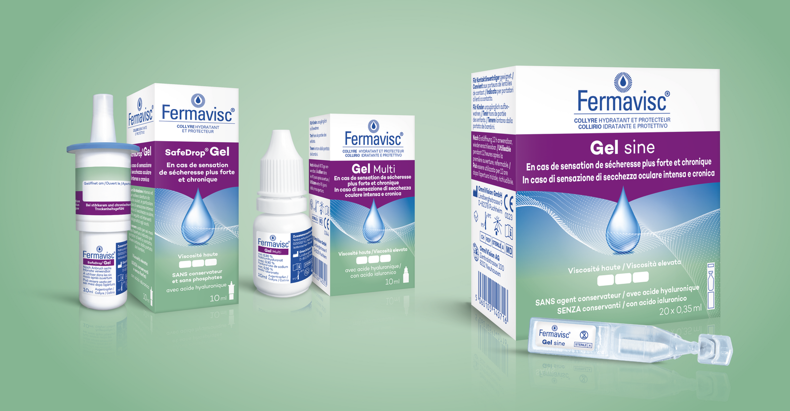
To this end, we have shown routes with various steps, varied and balanced the color weighting between the striking blue of Hylo-Vision® as the 'parent brand' and the Fermavisc green, and also chosen the typography of Fermavisc® to be finer and more valuable. In terms of branding, the question also arose of how far to approach the design of Hylo-Vision® and still take into account the longer name and a concise word/image brand.
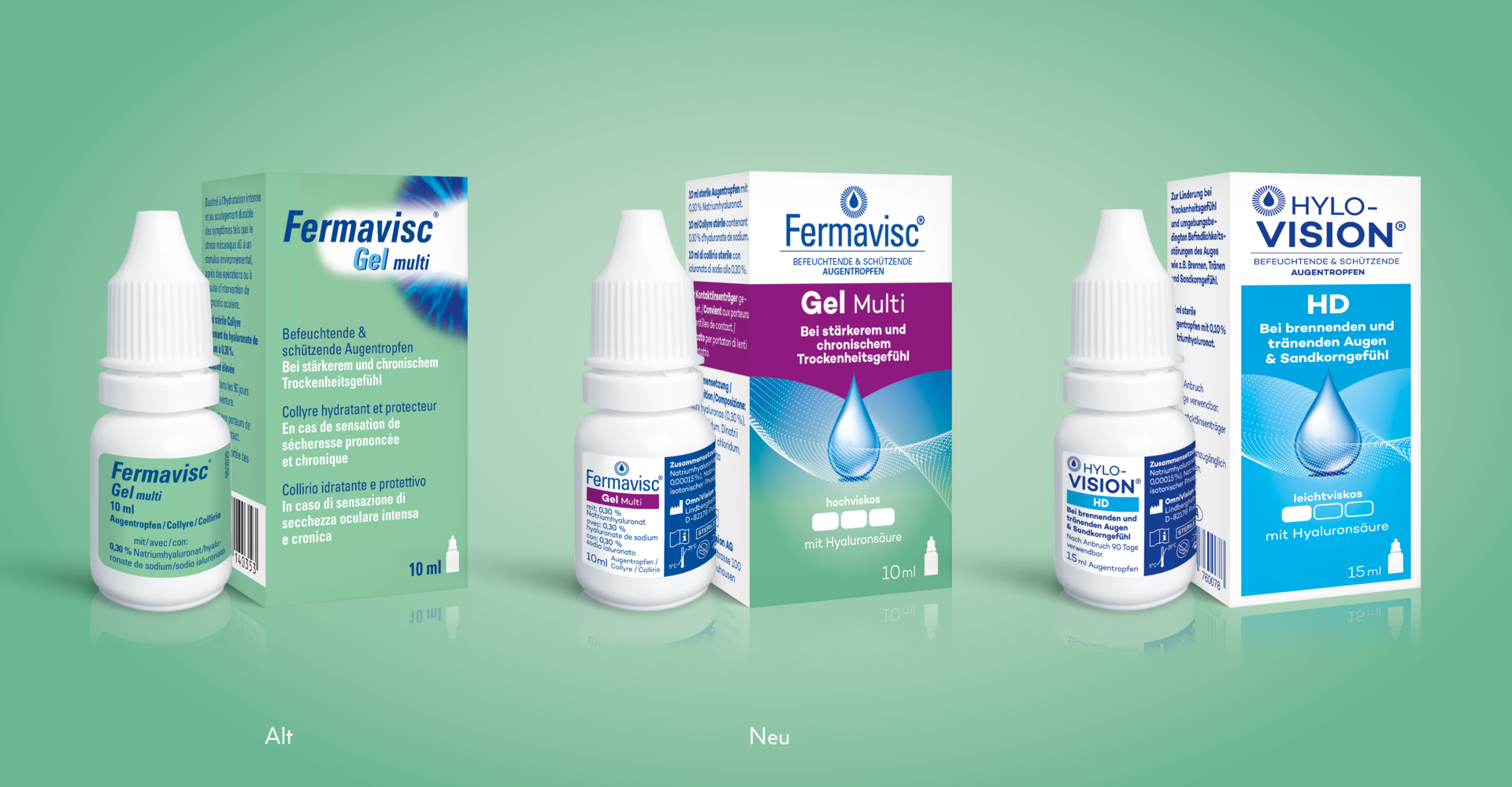
In the end, the packaging design was adapted very closely to the German design, and we also relied on these color values in the color selection based on our experience in the print implementation of the Hylo-Vision® range. A special challenge for the final artwork was still the combination of the blue-green color gradients in the lower area of the packaging around the blue drop and the "net". On the one hand, the blue drop had to be shown off to good effect and the green tone still had to pick up on the freshness of the original Fermavisc® packaging. In the end, several proofs led to the desired result.