Sanofi-Aventis – BoxaGrippal®
Effect also at the POS
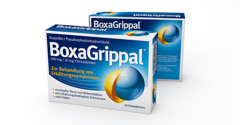
How do you manage, as BoxaGrippal® does, to gain one of the top brand positions on a pharmacy shelf that is densely packed with tried-and-tested cold remedy products? Certainly, the active ingredient composition is the basic prerequisite for acceptance and success, but there are a number of obstacles to successfully overcome before a product can be purchased. As experts in packaging design, we are familiar with these requirements and always take into account the entire initiation and purchase situation when designing a successful product. BoxaGrippal® is a very good example for this.
In 2015, the then Boehringer Ingelheim Pharma GmbH & Co. KG - now under the umbrella of Sanofi since the takeover in 2017 - contacted us for the launch of a new brand in the cough and cold segment based on two components. In order withstand against strong competitors in the new market environment, the pack to be developed was to be impactful and differentiating new to the top dogs on the shelf. A concise name logo had to be developed and the active promise and areas of application had to be communicated on the packaging. So far, so good.
In a design project, it is always important to us to consider the framework conditions, how the brand will be launched on the market or how it is already present there. So it was clear from the start that higher advertising support would accompany the launch, communication was still to be developed, but here we saw the main task of product explanation. What does the packaging then communicate on the shelf, in the purchasing situation, during the consultation with the pharmacist or PTA, and subsequently with the consumer at home? Where is the product sold, in the pharmacy as a so-called OTC in Germany, in European or international markets with completely different POS situations such as drugstore, online or pharmacy? How do the competing products appear, where is the USP of the brand and what is the consumer's motivation to buy? And what can a package in the OTC segment convey from two to three meters away?
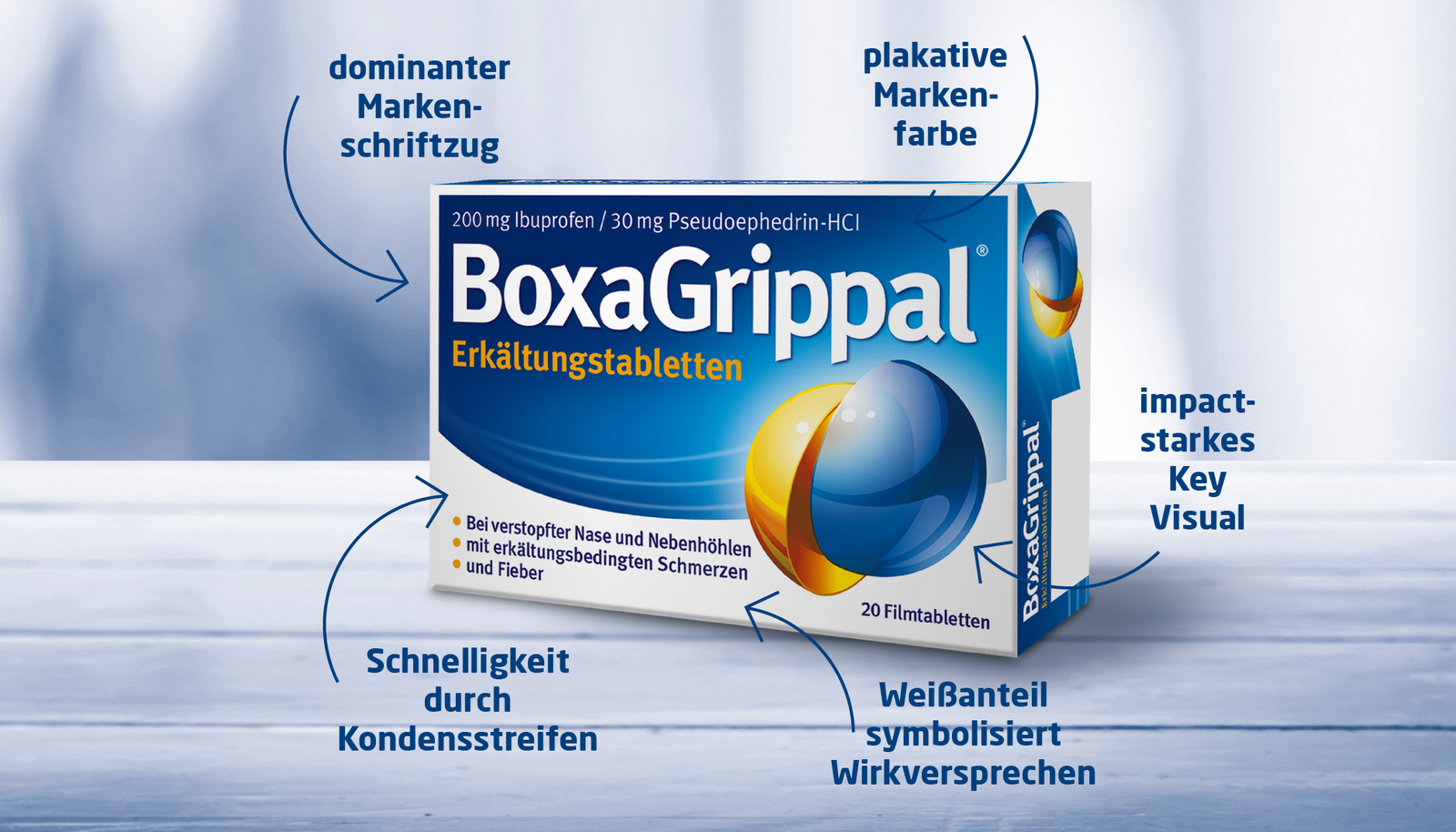
With the design developed, BoxaGrippal® strongly distinguishes itself from the competitor brands and achieves a high level of attention. The striking design - which can also be excellently reused in the entire brand communication - builds on a color that stood out from the competitors at the launch: a dark, valuable blue that symbolizes strength and freshness. The white frame on the edge further supports the blue pack on the shelf and gives it "grip." The concise, negative white brand lettering across the entire width of the pack in Bold visually separates the two word components "Boxa" and "Grippal," thus communicating strength and application while standing out legibly from the background. Both together - white border and white brand lettering - also increase the obligatory white content in the German paragraph space and symbolize impact.
At the same time, we advocated a strong key visual for recognition from advertising instead of clarifying illustrations or pictograms. The representation of the two active ingredient components in the form of two colored hemispheres prevailed, which also convey innovative character on the cold medicine shelf through their visualization and are thus attention-grabbing and easy to remember. A yellow hemisphere was chosen as a contrast to the brand color blue, which associates warmth and well-being and draws the eye to the key visual, thus strengthening it. The curved, ascending and dynamic blue background supports the power and effect of BoxaGrippal®. The white "contrails" represent speed and the glow behind the hemispheres symbolize recovery. The white portion at the bottom of the pack enhances the medicinal promise and gives the blue pack better "stand" and contrast on the shelf. Listed on the shelf and as a quick information and confirmation for the pharmacists/PTA and consumers, the most important applications are listed again.
The design was the clear winner in the market research and also provided an essential basis for the communication developed in parallel, so package design and advertising go hand in hand. The success - number 4 in the market after one year in a highly competitive environment - confirmed the concept and increased the pressure for the next project: "BoxaGrippal® was a success project, this time we have to be even better"! We are working on it ...
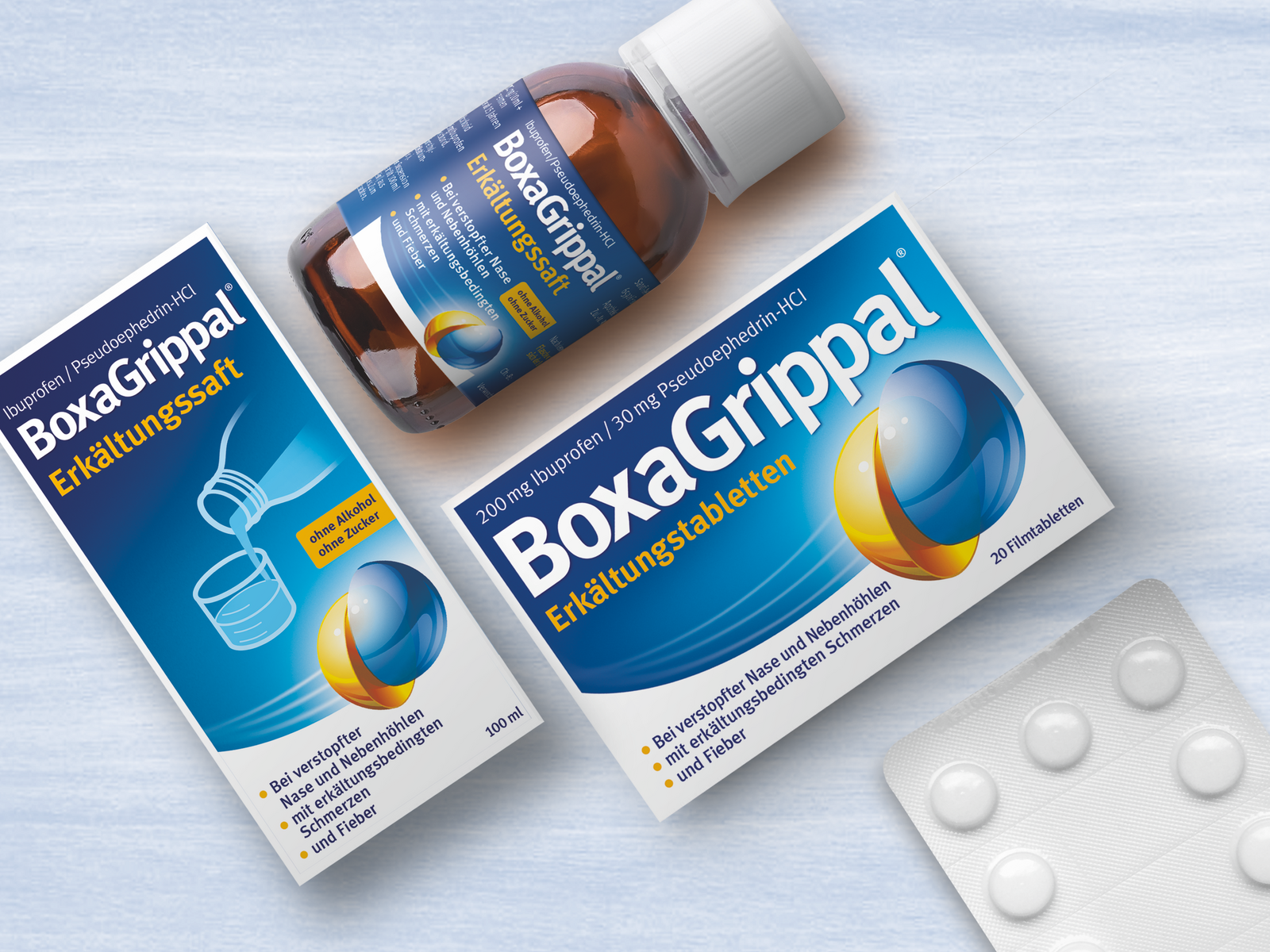
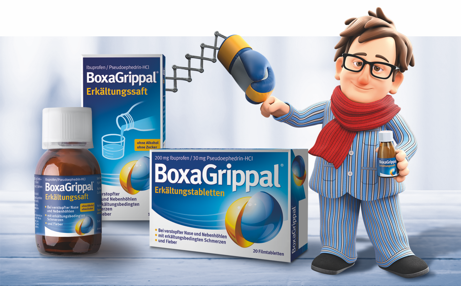
Four years after the successful launch of the brand, BoxaGrippal® hit the pharmacy shelves in liquid form. "BoxaGrippal® Cold Juice" is Sanofi's first line extension since taking over the OTC division from Boehringer Ingelheim Pharma.
