Breitsamer honey
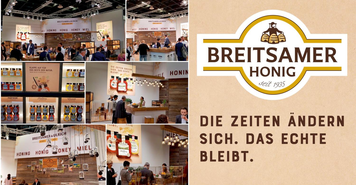
Times are changing. The real thing remains.
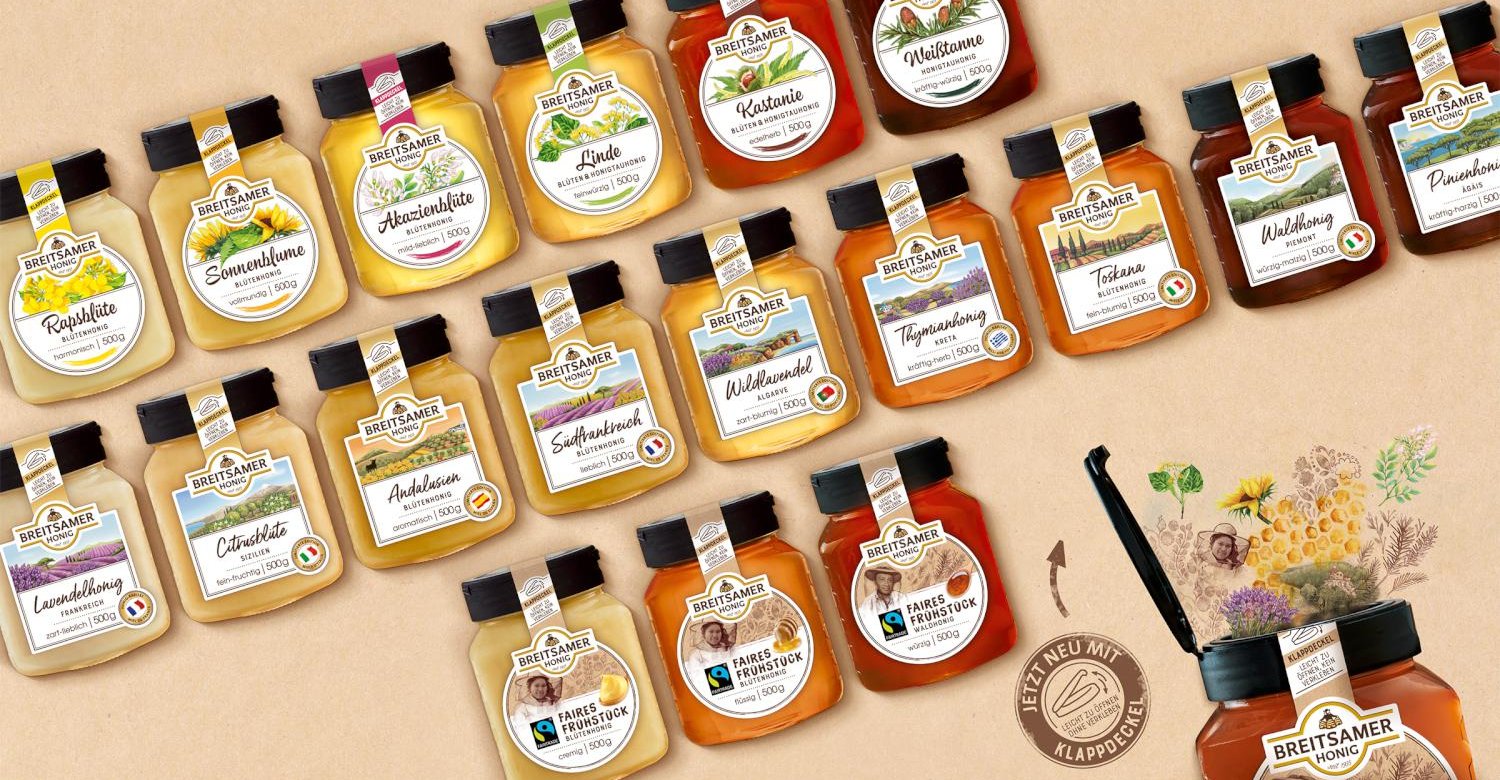
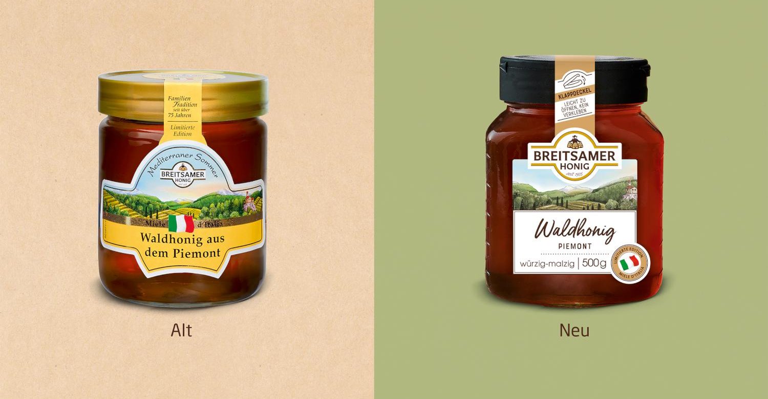
Breitsamer is a brand with a long tradition and high quality. Despite the company's long history, Breitsamer keeps its finger on the pulse of time. Thus, the company is always dedicated to new topics that concern the clientele and should make everyday life easier. From this they developed a new innovative hinged lid. This prevents the lid from sticking and at the same time provides a storage surface for the spoon. "Always easy to open without sticking togehter".
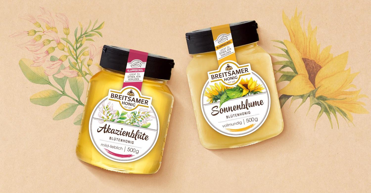
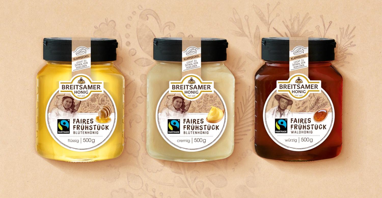
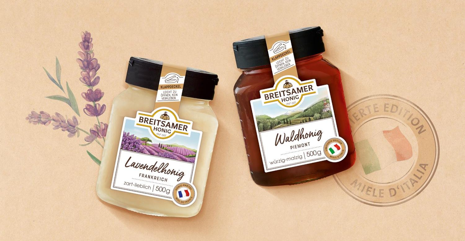
In the course of this, the design was revised. A design that combines tradition and modernity in equal measure, in addition the product novelty is communicated. It is tidy, clearly structured across the segments and offers the consumer a clear line of orientation - information hierarchy. The countries and flowers get more importance and let the design become more emotional. This expresses the special nature and naturalness of the products. To round off the appearance, we also designed the graphics of the booth.
