Hofpfisterei – Relaunch 2023
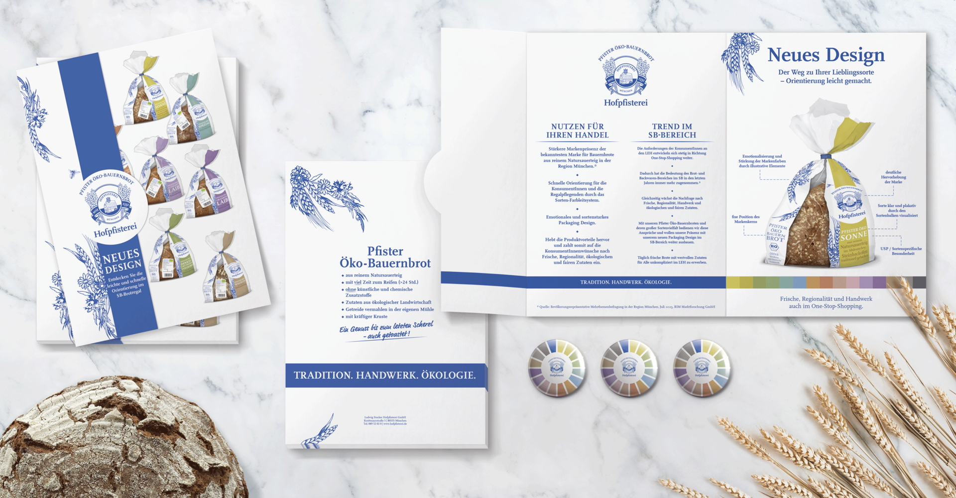
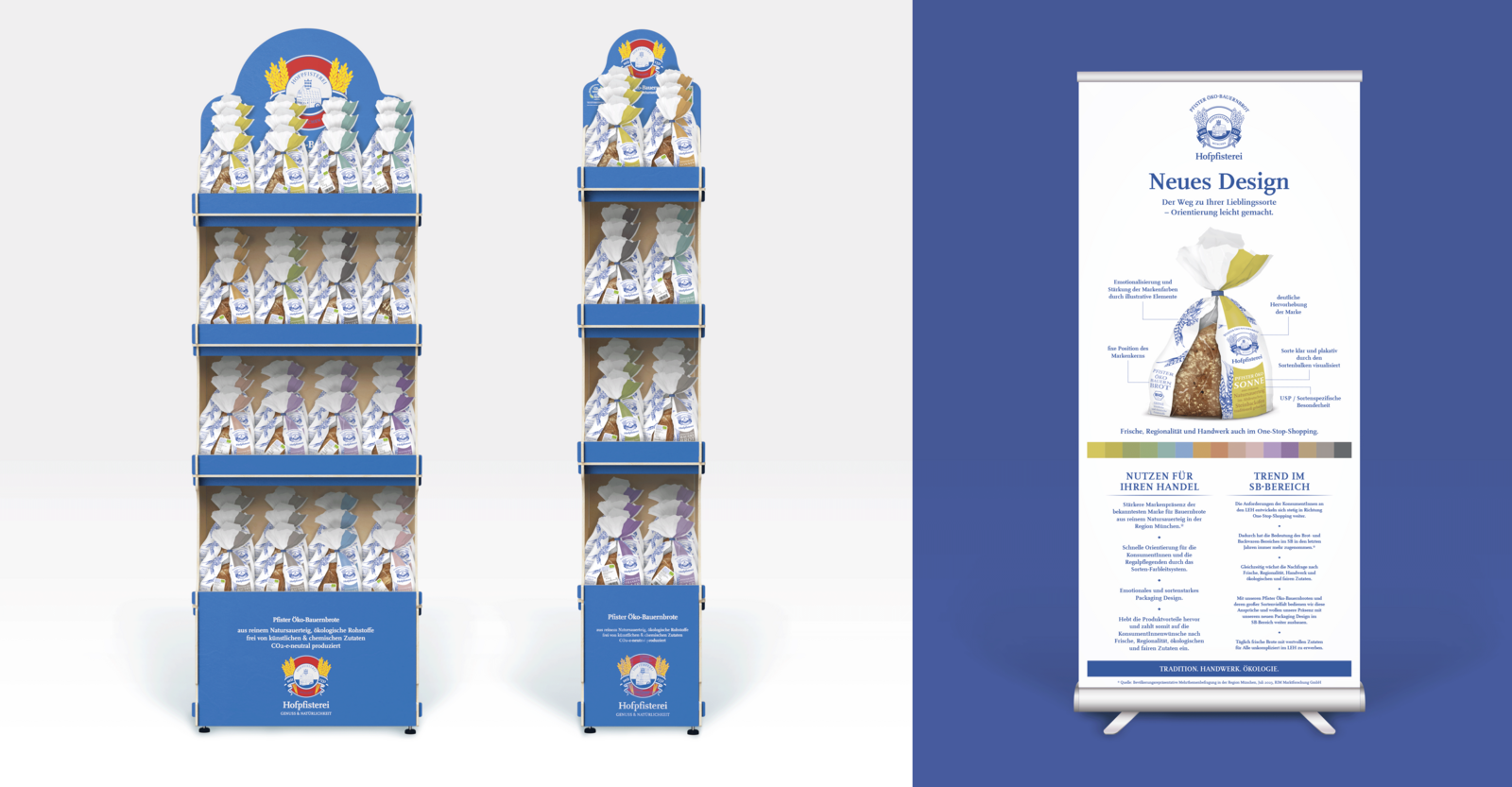
The way to your favourite variety – orientation made easy.
What concerns today's consumers?
They don't have time, yet conscious nutrition is important to them. These product values need to be communicated quickly and easy to find on the shelf. But in the fresh bread segment, things look very different.
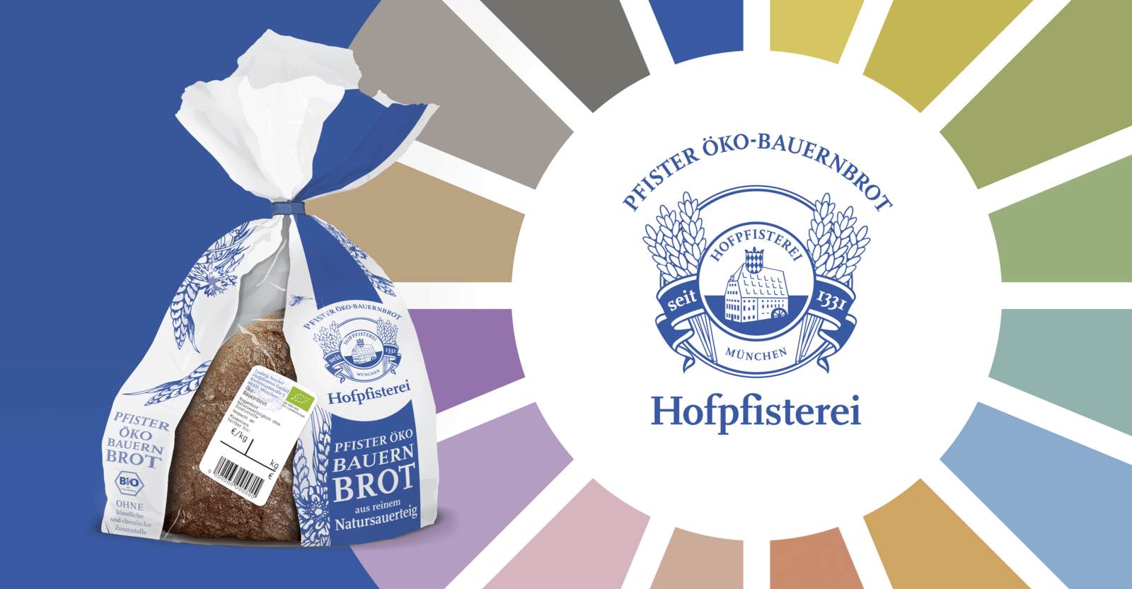
Hofpfisterei tackled precisely this challenge with us. We analysed the bread bag, worked out the most important components and messages and reduced them to the essentials.
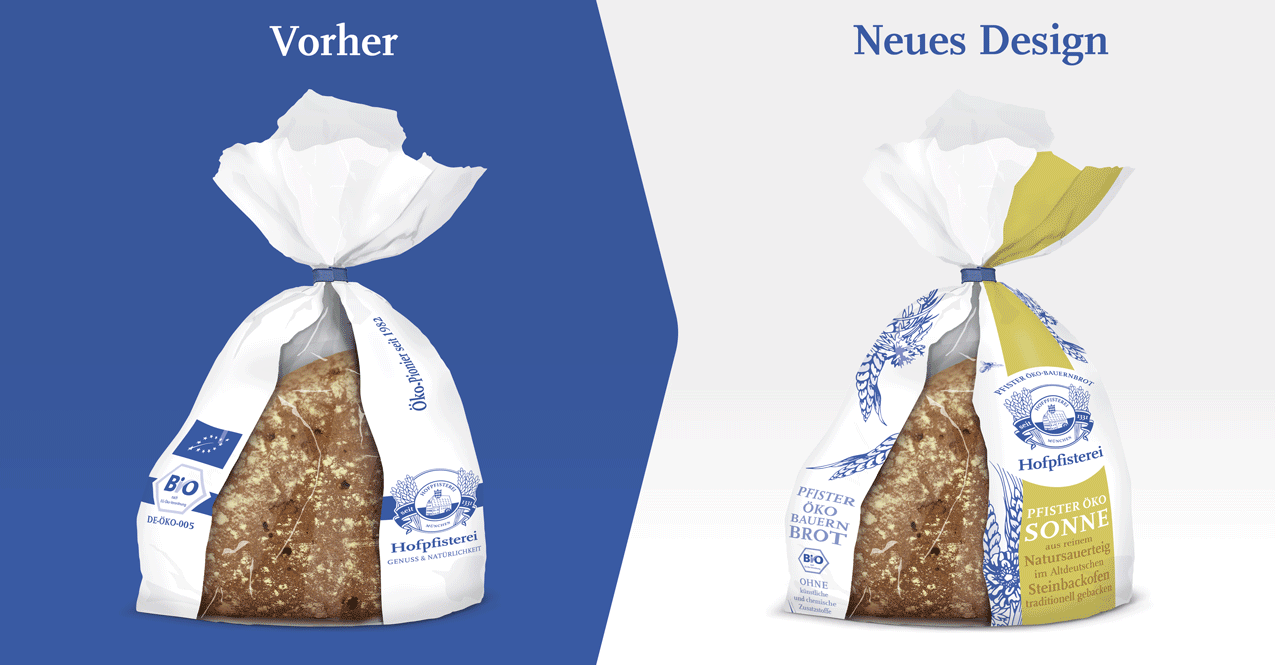
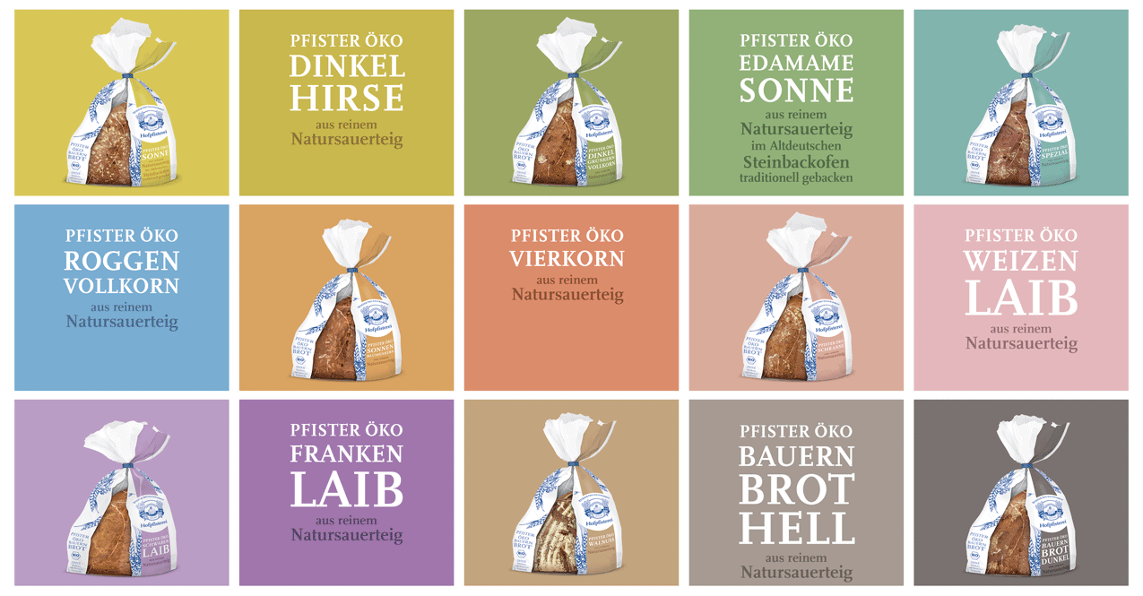
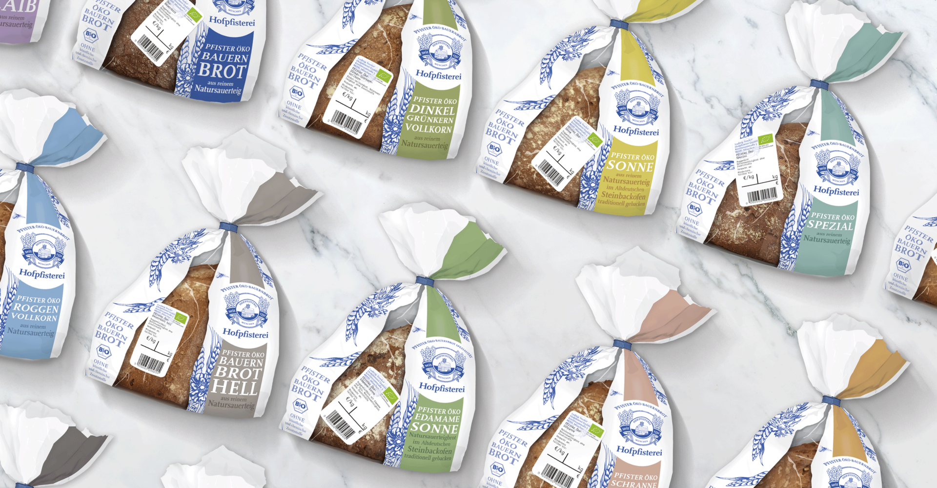
The result is an emotional and strong packaging design. The brand is clearly in focus, the variety is strikingly visualised by the variety bar, in which the USPs of the respective bread variety are communicated. The deliberately narrower left-hand side conveys the brand essence "Pfister organic farmhouse bread". The product benefits of "organic and without artificial and chemical additives" are clearly emphasised, thus responding to consumer demands for freshness, regionality, organic and fair ingredients.
The single-variety pouches allow mandatory information to be removed from the label and placed on the reverse. This makes the label significantly smaller and we achieve greater product visibility.
Newly interpreted blue and white illustrative elements of the previous bread bag ensure emotionalisation and reinforcement of the brand colours.