Alnavit – PUR+ Launch
Health should be fun!

A colorful mix, according to clear rules.
Following the successful relaunch of the FREI-VON and PUR ranges from Alnavit (for food allergy sufferers), a range of superfood products or products with added value was to be launched in 2015. These products were to be located under the Alnavit brand, but clearly differentiated from the previous ranges.

Having already chosen an illustrative style for the product/ingredient illustration in a previous step for smoothies, PUR+ Design followed this approach and developed it further. At the same time, a colorful, attention-grabbing mix of colors was also chosen for the products, which pays attention to the product characteristics and provides strong variety differentiation on the shelf. The ornaments of the ingredients - each derived from the 5 product categories - are loosely grouped around the speech bubble and can be varied accordingly for different pack formats. The respective product is further underlined by an illustrative element that picks up the benefit. All products are bilingual for the German-French market.
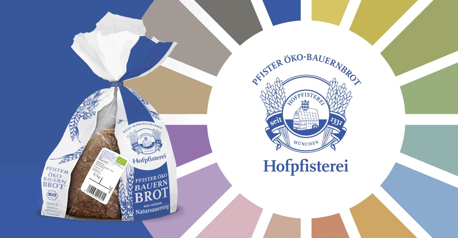
Clear color spectrums and coordinated typographic, background, ornamental and illustration colors were defined as the basis for the many colorful color combinations. The product packaging uses these to guarantee consistent colors and legibility as well as a guarantee in the print implementation.