Hama exhibition-stand concept
'Hama well done!'
After several years of working for Hama in packaging design, the customer asked us to visit the IFA in Berlin in 2010. The Hama trade show team was not satisfied with the booth design and expected new impulses from us thanks to many years of positive cooperation. On the one hand, the IFA is one of the most important retailer exchanges for Hama, on the other hand, the appearance towards the end customer as a visitor of the IFA should be optimized.
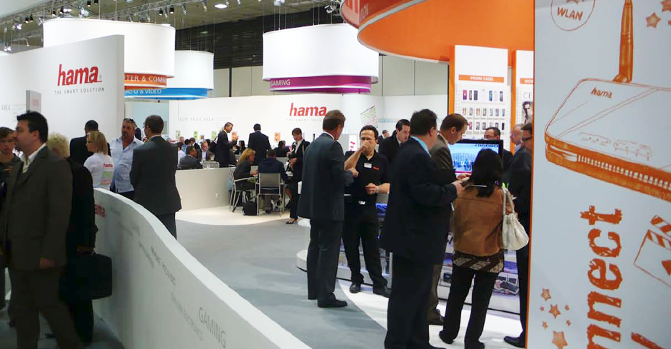
Our analysis quickly revealed an unclear brand hierarchy, disturbed by prominent secondary brands that the end consumer does not see in relation to Hama, a passive end consumer area with little news value, separated from the 'exciting' retailer area with news. The color scheme was Hama-untypical and colorful, the impression of the own exhibition hall resembled a passage hall, in contrast to the event halls of the large IFA exhibitors.
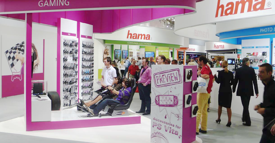
Together with the marketing managers, we developed a superordinate brand hierarchy, determined Hama areas visible to the consumer and secondary brand segments visible only in the reseller area, opened up the stand to the end consumer without granting him direct access, and designed 5 sub-areas in the passageway area of the hall. For these sub-areas, we jointly developed the most important new products, which were presented by experienced sales people and animators for end consumers and - in function of an extended showroom, also for resellers - in an eye-catching way.
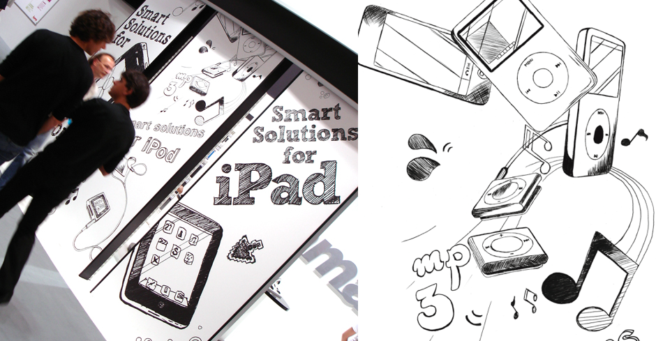
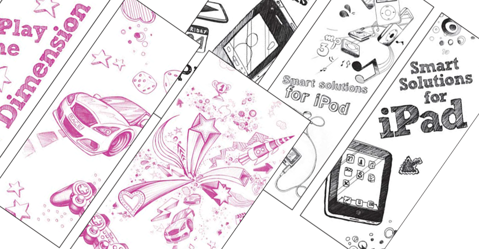
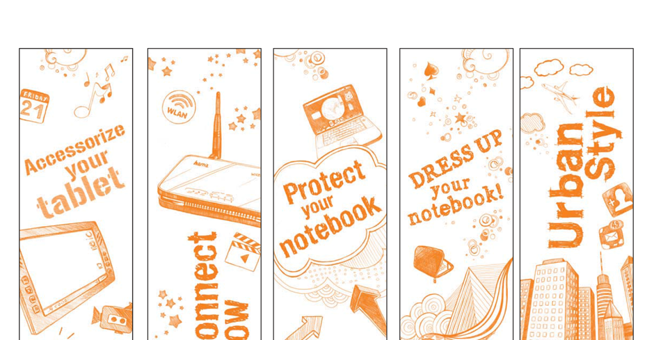
As a common visual world, the modern but restrained scribble and visual language already used in-house was defined for the new products and areas, which in turn picked up on the color worlds of the in-house product areas. With the modern and attention-grabbing stand design in accordance with the brand hierarchy, the stand builder completed the very successful stand concept for Hama's subsequent years and trade fairs.
