Milasan – Relaunch
Baby milk range in a new look with feel-good character
Milasan has been accompanying young families for over 50 years as a mid-price brand and has proven itself over generations as a responsible brand of high-quality infant and toddler nutrition.
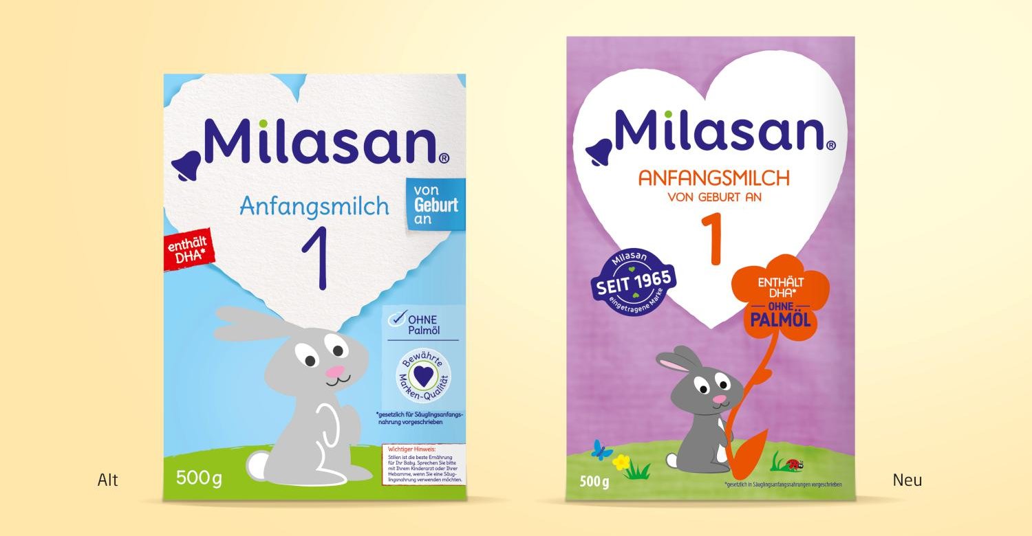
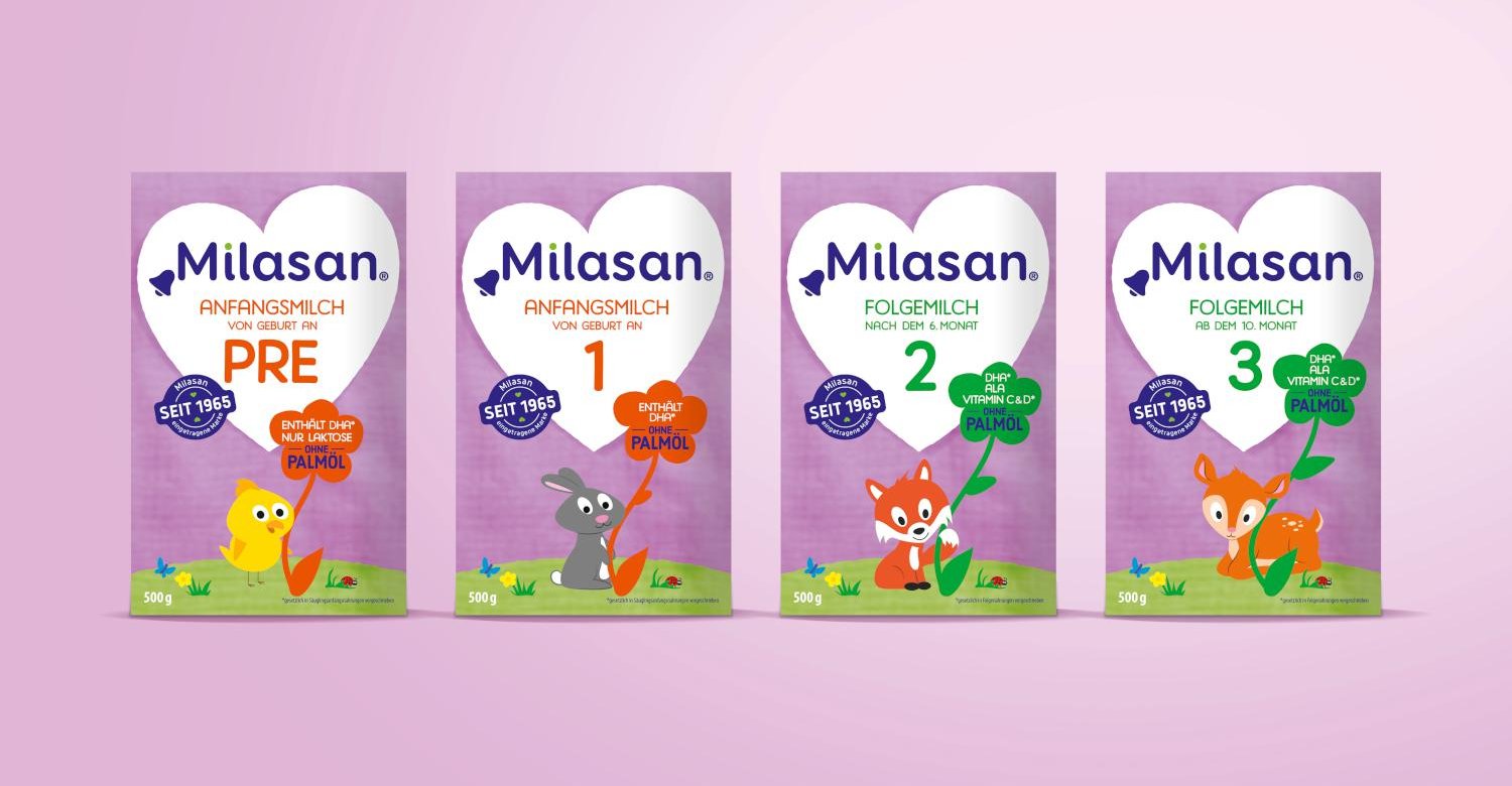
Objective: The primary objective of the relaunch of the Milasan baby milk range was to create an improved brand appearance on the shelf and thus lay the foundation for communicating the new positioning "Milasan - a good feeling right from the start". Further objectives were to strengthen the positive brand image and to qualify the brand perception to even more safety and well-being. The new brand appearance was to give consumers a good feeling right from the start and be easily understood across the different age groups.
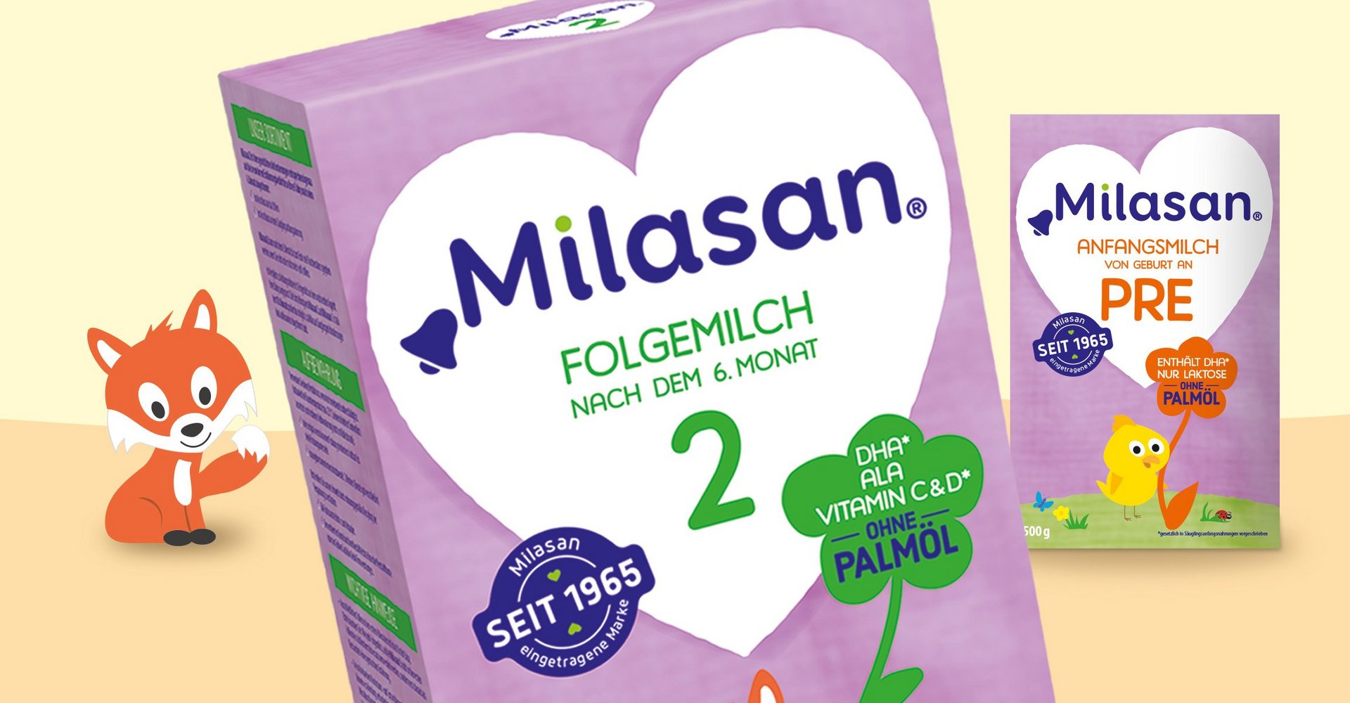
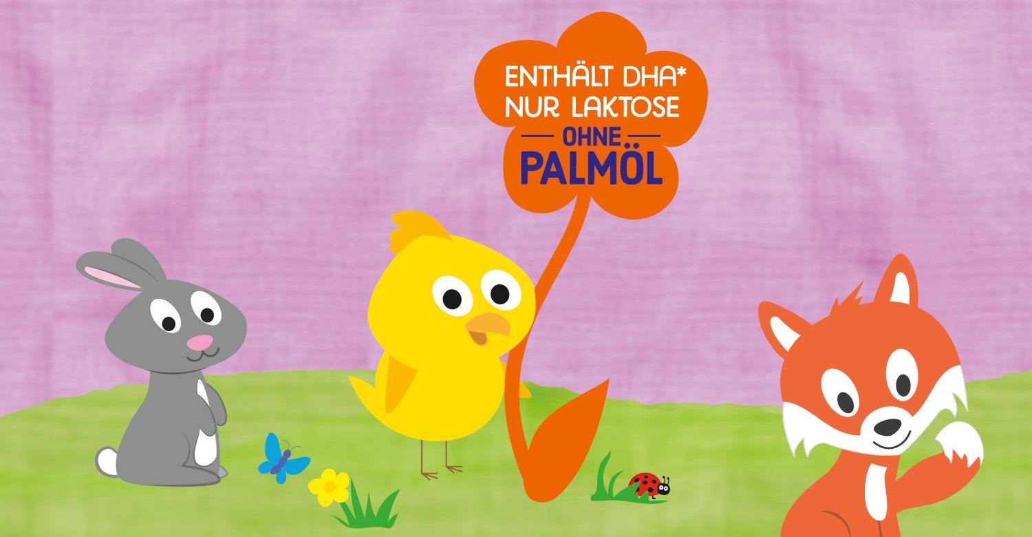
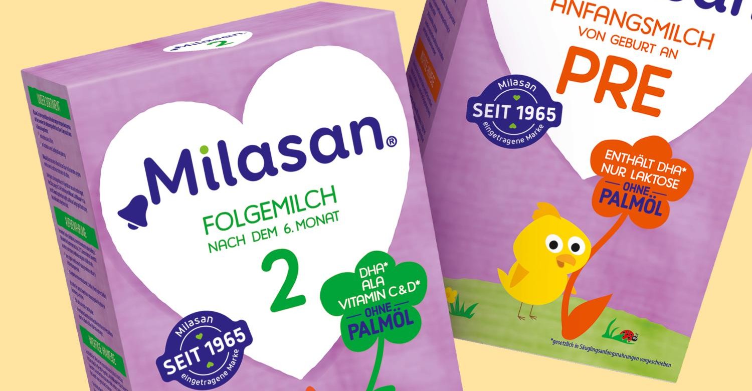
The result: a uniform brand color that is unique in the competitive environment was defined as the brand essence for the Milasan range. A lively light purple background was created, reflecting the association of a muslin cloth. After the relaunch, the brand-defining heart visual becomes even more prominent in the brand design, is now more clearly recognizable on the front of all packs, and is the most important core element of the packaging alongside the new brand color.
A new qualitative look for the Milasan brand with a feel-good character, quick orientation and high shelf impact.
