Salvus Mineralbrunnen – Launch TÖFTES!
New lifestyle brand concept for fizzy drinks
Salvus' first mineral water well was put into operation in 1994. The Münsterland region and Lower Saxony as far north as Germany, as well as the Ruhr region, are the main sales areas of the regional supplier of mineral water, spritzers and sodas.
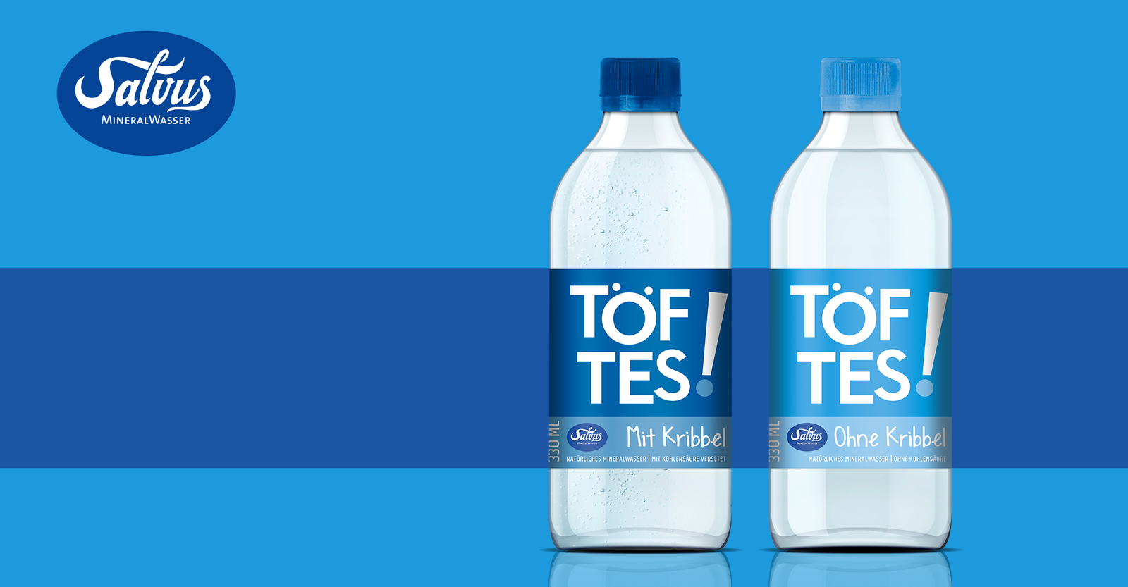
With TÖFTES! Salvus is now conquering a new, trend-conscious target group. Because drinking water is and remains "in": so the step for a new brand in this segment was not far.
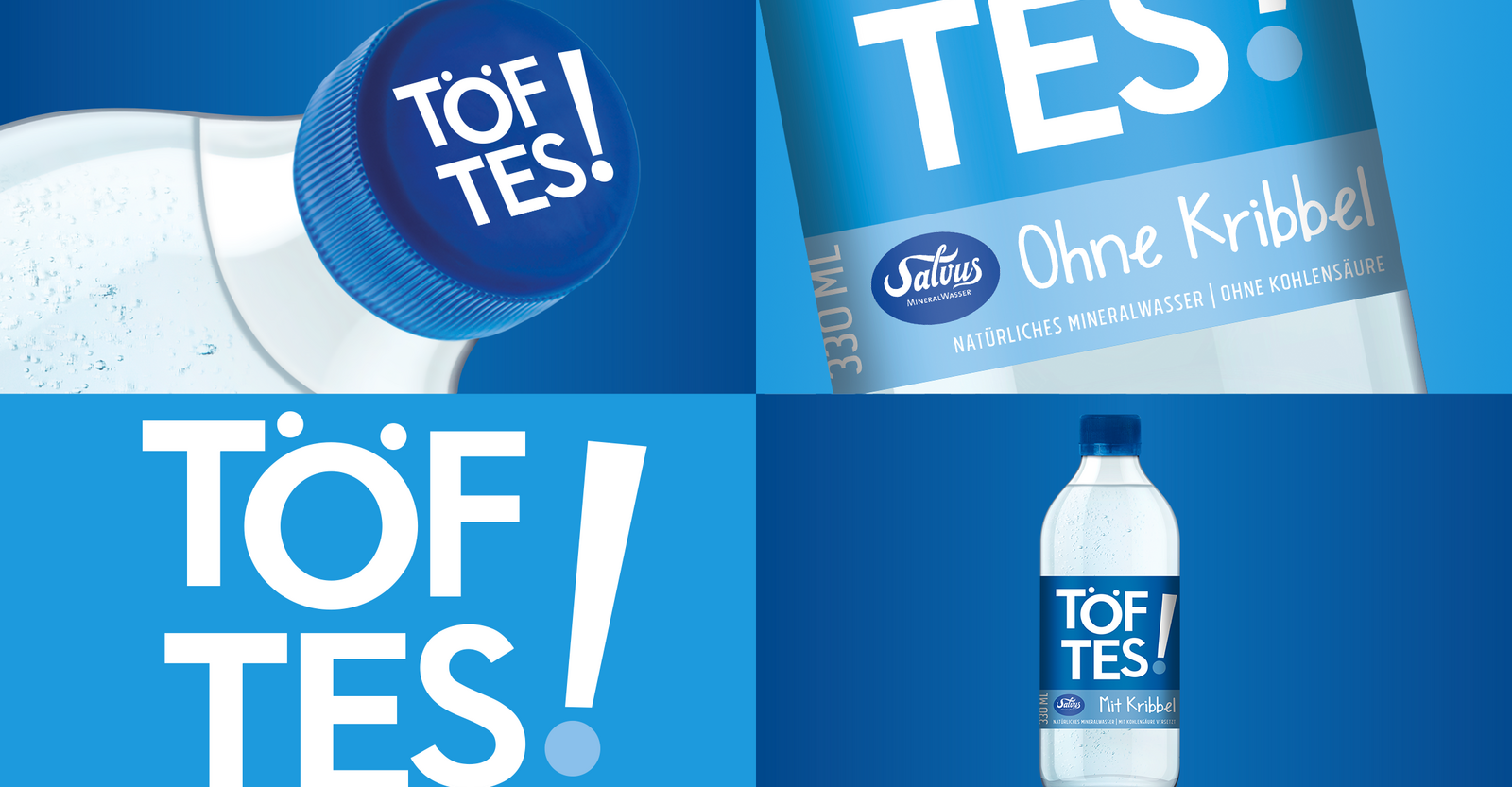
The brand concept: take small bottles, a unique name, a puristic and humorous design - that's TÖFTES! The name is derived from the local secret language of the people of Münster (the "Masematte") with about 500 vocabulary words. The meaning of tofte/töfte in the Masematte language is "good, beautiful" - from this the independent humorous-traditional name creation TÖFTES was created for the new brand!
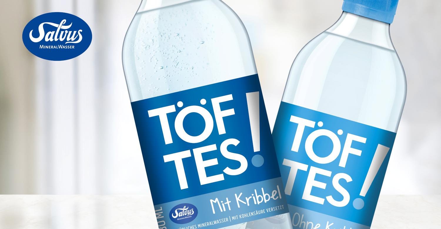
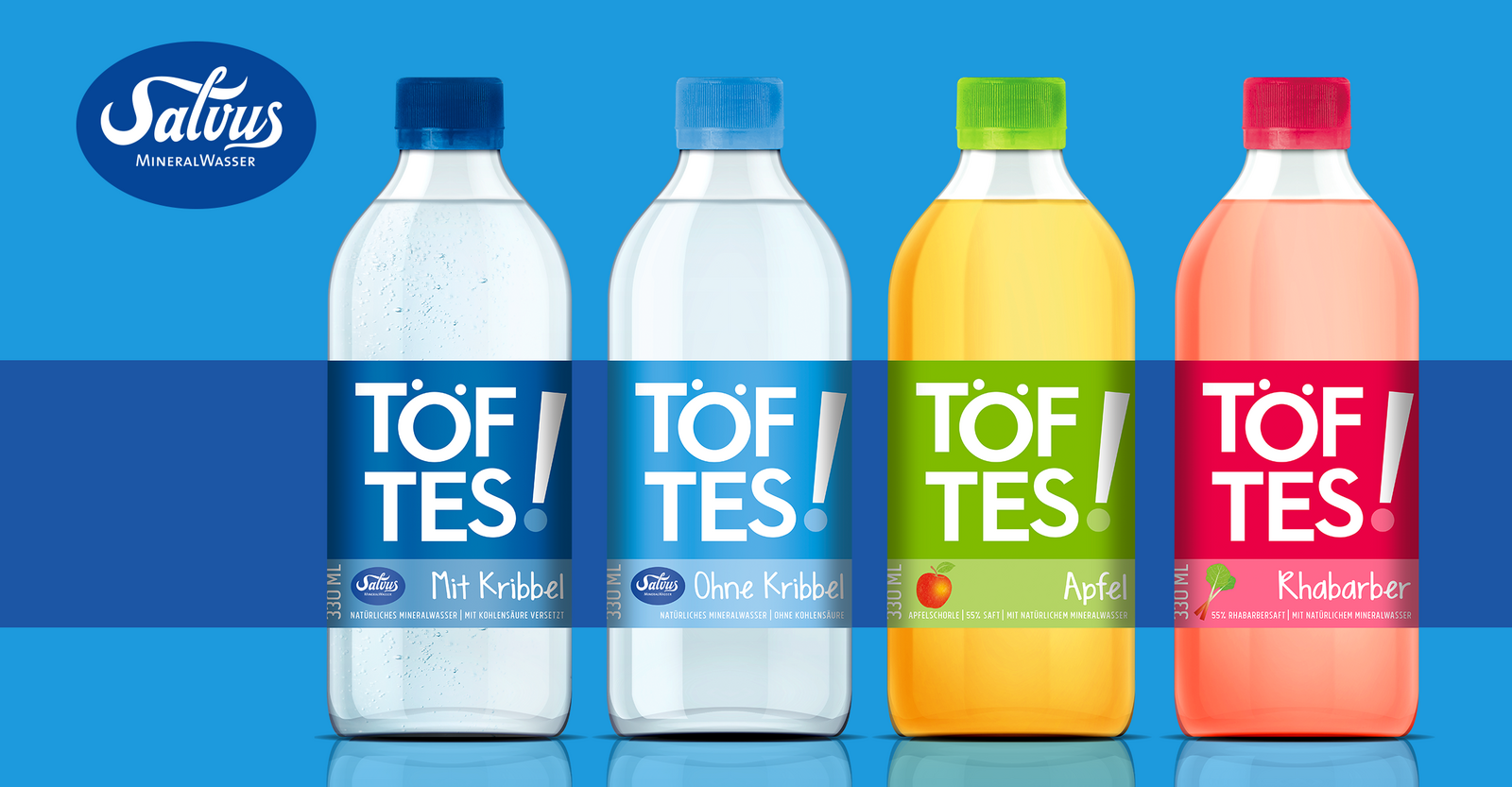
The small, knobbly, likeable bottles - that's how people drink water today, with or without a paper straw, in the bar, on the beach with friends - with tingle or without tingle. The design - striking, pure, associative, cheerful, with a twinkle in the eye, and certainly not old hat - that is the design language of the lifestyle brand for the active, trend-conscious target group and also of TÖFTES! Salvus TÖFTES! starts with five articles: TÖFTES! with tingle, TÖFTES! without tingle, TÖFTES! Apple, TÖFTES! Rhubarb and TÖFTES! Coke.
The new design was posted by the design blogs Packaging of the world and Design made in Germany.
