Salvus Mineralbrunnen – Relaunch Portfolio
Mineral water, spritzers and sodas with a new look
In 1994, Salvus' first mineral water well from Emsdetten was put into operation. Münsterland and Lower Saxony as far north as Germany, and also the Ruhr region, are the main sales areas of the regional supplier of mineral water, spritzers and sodas.
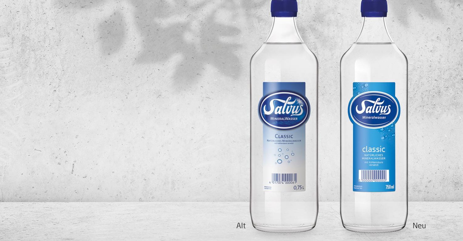
The main Salvus brand, which bears the company's name, underwent a relaunch.
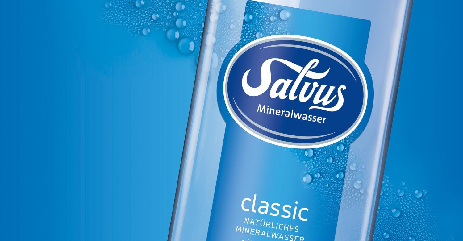
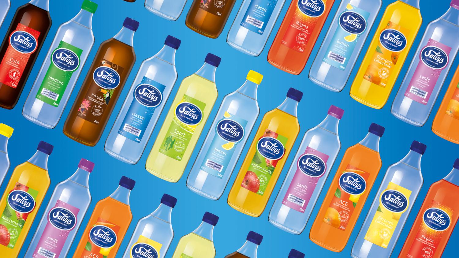
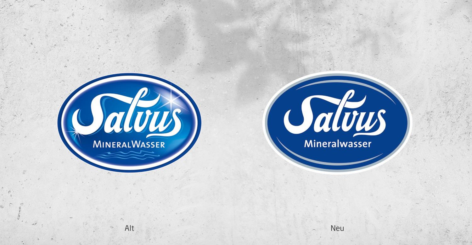
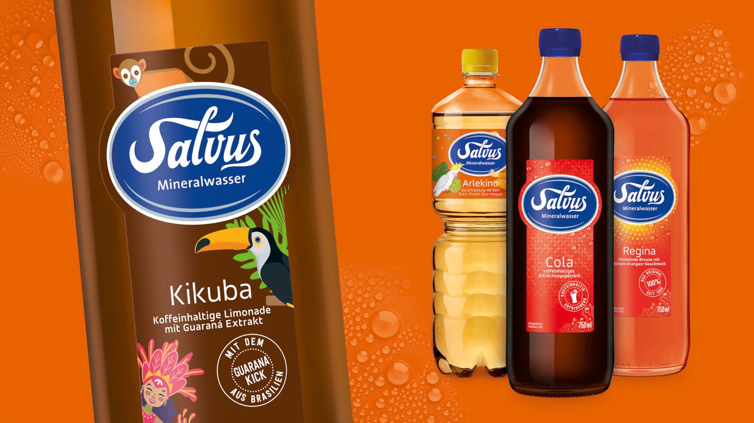
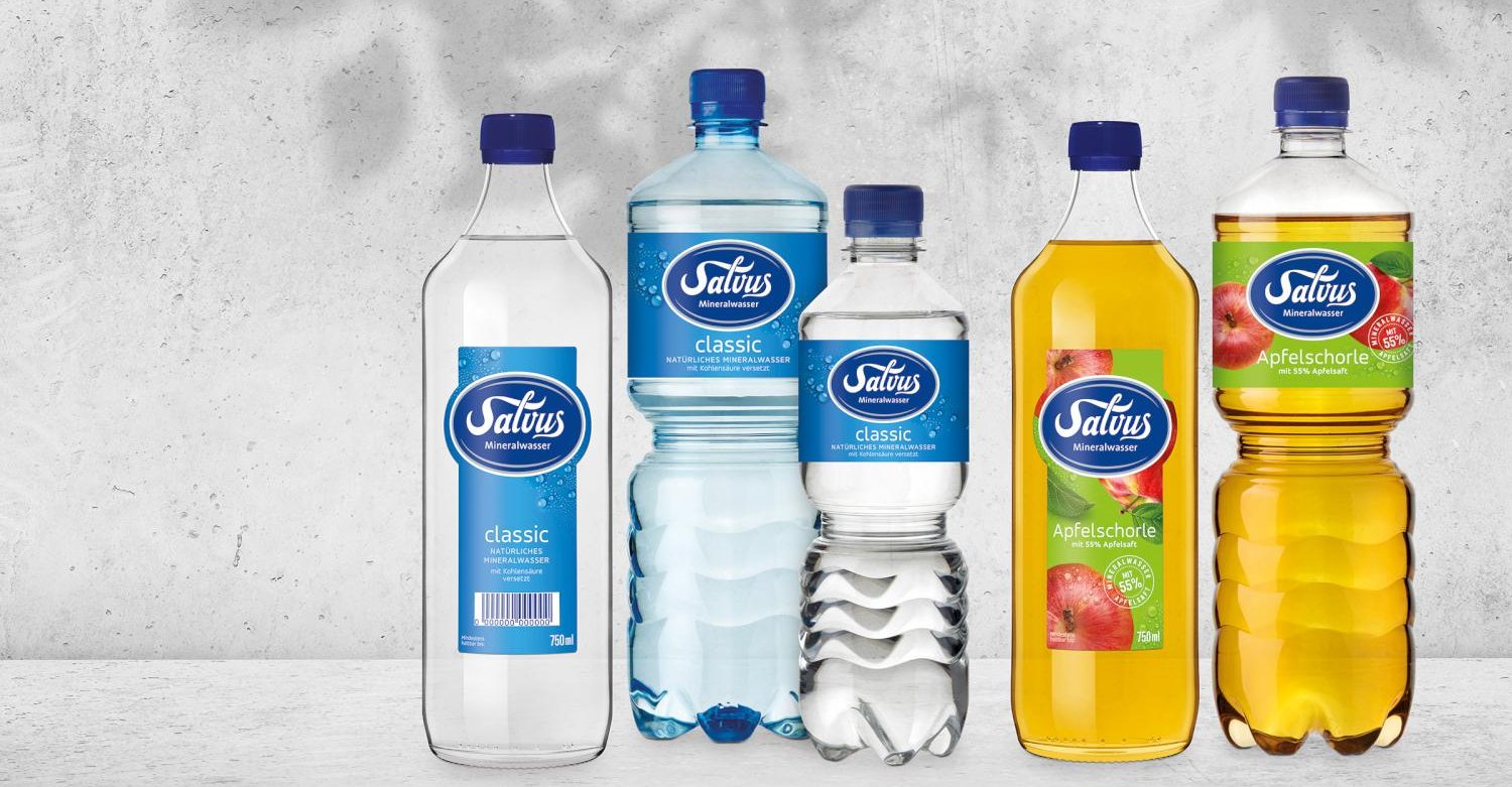
Entirely under the motto "A Clear Refresher," the complete portfolio - consisting of 14 mineral waters, spritzers and sodas - has been revised. At the center of the new brand identity is the Salvus brand logo. It is also the company logo. With its reduced colors and the renunciation of all effects and decorative elements, it gains in assertiveness and sovereignty.
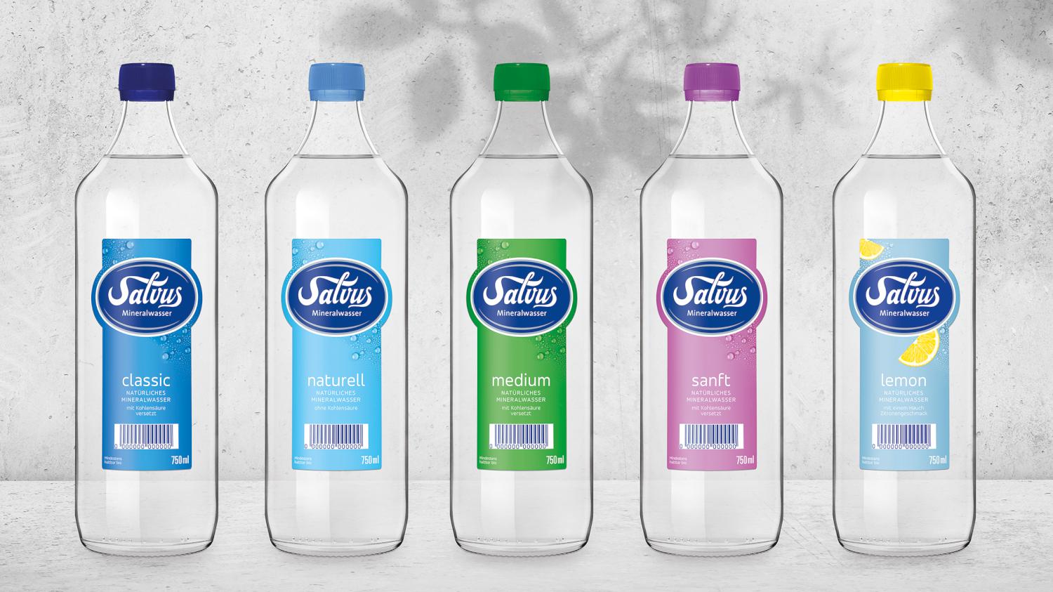
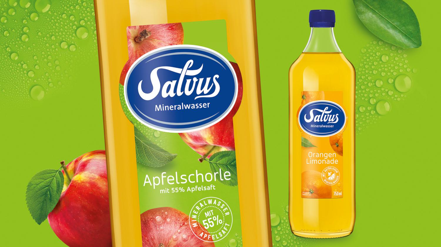
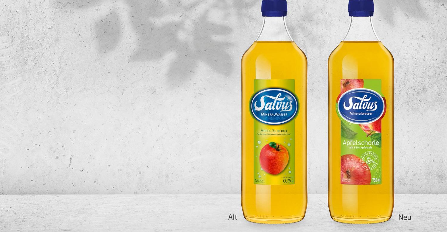
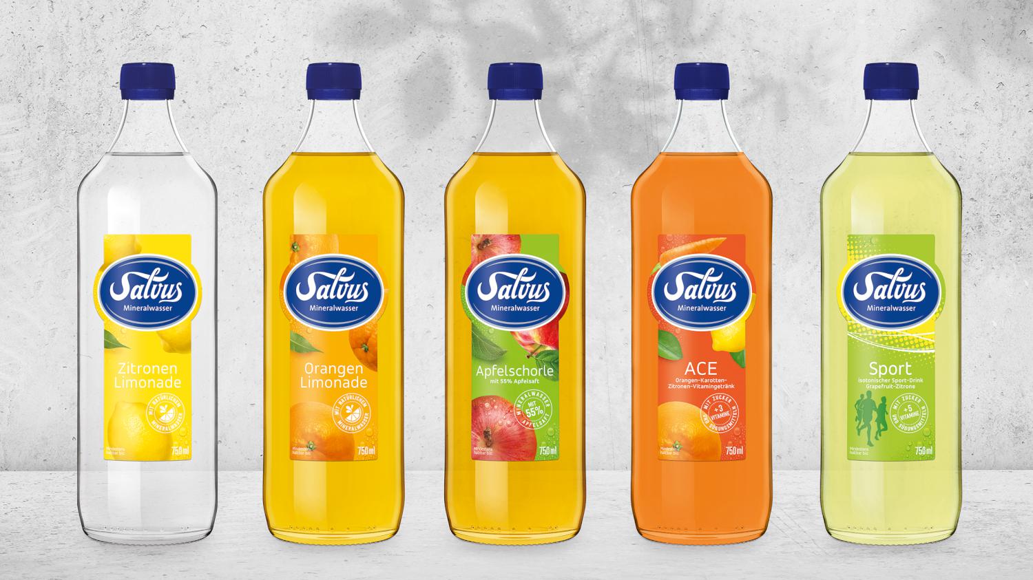
The extensive portfolio is structured by strong variety coding via clear colors and the individual design elements for each segment: clear fresh mineral water - naturally fruity spritzers and lemonades - cheerful young sweet-drinks. Fresh colors, the confident logo and subtle product typography define Salvus' new look.
The result: a clear, fresh design - focused on the essentials.
