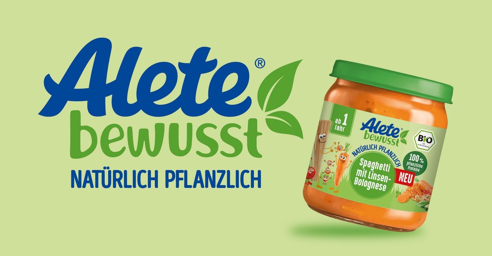
Harry – Relaunch "Unser Bäckerfrisches"
Daily freshness, from Harry freshly packed


As the name "Unser Bäckerfrisches" reveals, Harry guarantees with this crafty range fresh bread as from the baker next door. By using natural sourdough, all 8 SKUs have a pleasantly mild taste and are particularly easy to digest. At the POS, Harry ensures that fresh supplies can be found on the shelves every day. From Q1/22, "Unser Bäckerfrisches" will shine in a modernized look.
The new design impresses with its boldness, modernity and focus on the essentials. The subbrand is strengthened and emphasized as a seal of quality on pack. The former "black band", which brackets the range, is now broken up and develops further into a flag that runs horizontally around the pack and cleverly connects the front and back. By integrating the striking Harry brand logo, the brand is now clearly pointed in contrast to the previous design.
The familiar color codes are retained and are slightly optimized for better differentiation. "Knolli" with its distinctive, recognizable word and image mark is also retained. With the design relaunch, Harry rejuvenates and refreshes the appearance of these particularly fresh breads and, with the integration of the Nutri-Score, ensures quick orientation at the POS to provide consumers with perfect support for their individual diet.