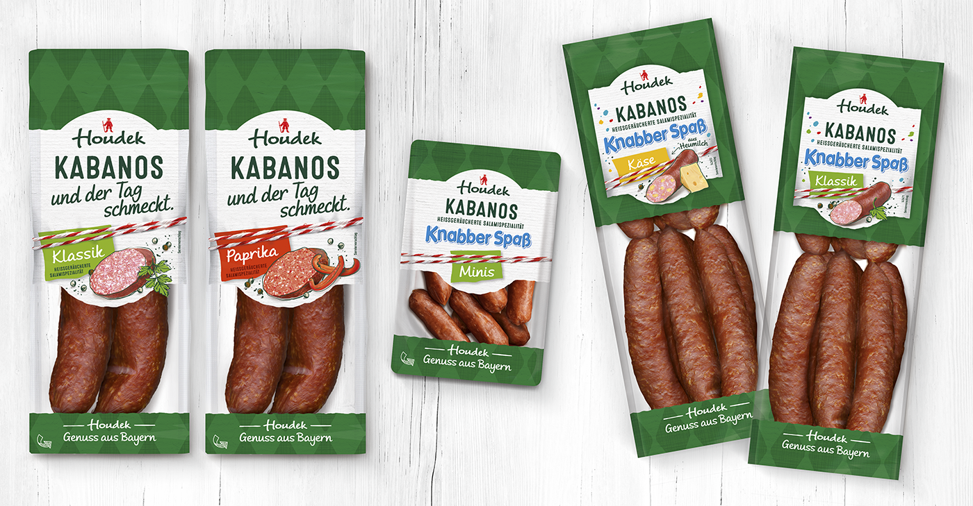
Harry – Relaunch toast and sandwiches
Design Touch Up for Harry's Toast Total Range


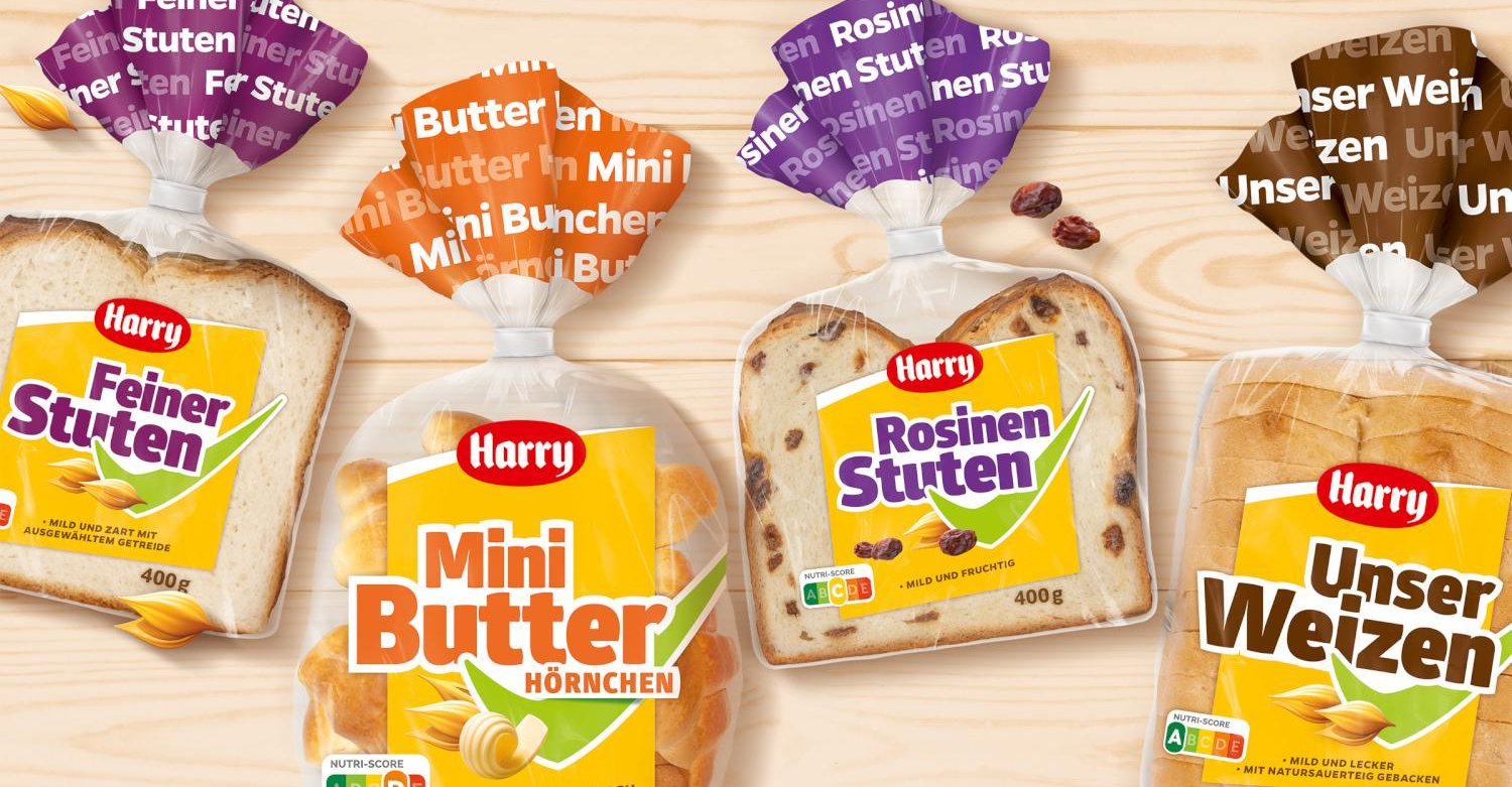
It has been impossible to imagine POS shelves without Harry's toast and sandwich range for years. The products, which achieve their special flavor through toasting, are particularly well suited as a breakfast base or as a lusty snack round the clock. As part of the 2021 relaunch, 13 items of the Harry classics are getting a new and modernized look - including toasts, sandwiches and toast rolls. Overall, the design has been modernized to match the design climate of the Harry brand. The result is a bold, strong, confident sub-brand design - typically and unmistakably the Harry look.
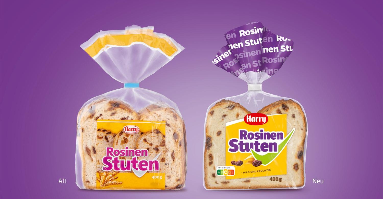
From now on, the sandwich slices and toast rolls will adhere to a fixed design grid with a uniform system. The design language of the viewing window and its dynamic lines to the top right give an aspirational, positive basic feeling and guarantee high product visibility, dispensing with the use of shooting material. Only on the toast rolls the special feature of the large-pored crumb is visually depicted. The Harry Toast varieties are given a special position in the range and gently deviate from the defined grid with a yellow, dynamically ascending color field and a light textured background in the lower area. They form a unit in themselves without losing their affiliation to the overall range.
A bundling of the categories is given by the variety-specific strong basic color around the viewing window. Illustrations communicate the valuable ingredients and the USP per product. A sub-brand-emphasizing green hook provides clear orientation for the clientele at the POS. Small subtleties, such as the use of the new product logo and the Nutri-Score, complete the new packaging.
The four sweet breakfast alternatives also get a new look in the course of the relaunch and are subordinated to the concise design system of the toast/sandwich design. The special bread shapes of the currant loaf was particularly challenging, requiring a new interpretation of the basic design. The contour of the delicate crust and the fine crumb, which are made particularly soft by the ingredients and the baking process, shape the appearance of the breakfast alternatives. To guarantee the greatest possible product visibility, the upper part is left free as a viewing window. For this purpose, the uniform yellow color field with the dynamic white bow element functions as a "label" in this product category. It provides a stage for the broken-up, overlapping item name (the green hook), the ingredient illustration, and the small flavor claim in the lower third. For quick differentiation, both the prominent ruffles and the product names are colored in a uniform varietal color that conveys a summery of fresh sweetness.