Khoisan – Relaunch
Natural, handmade and microplastic-free sea salt
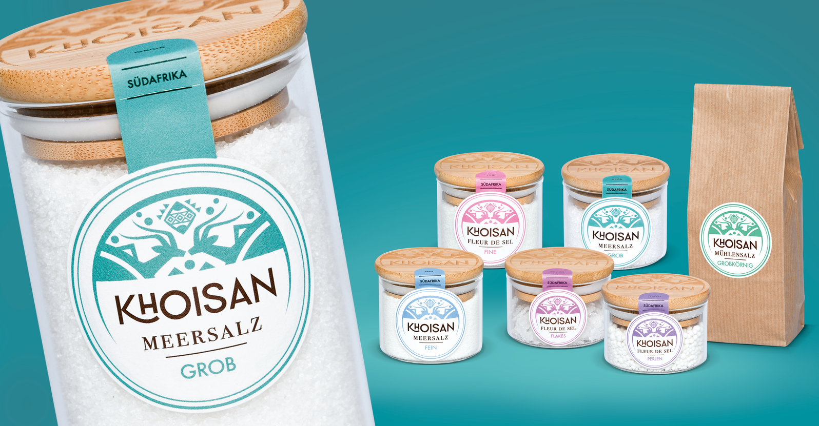
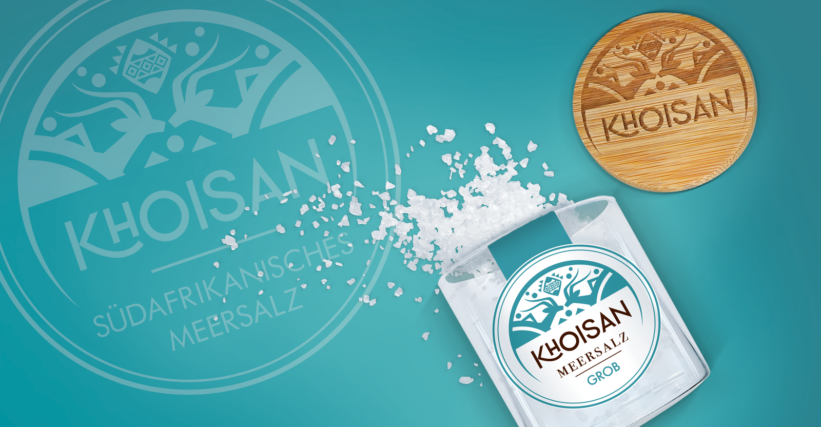
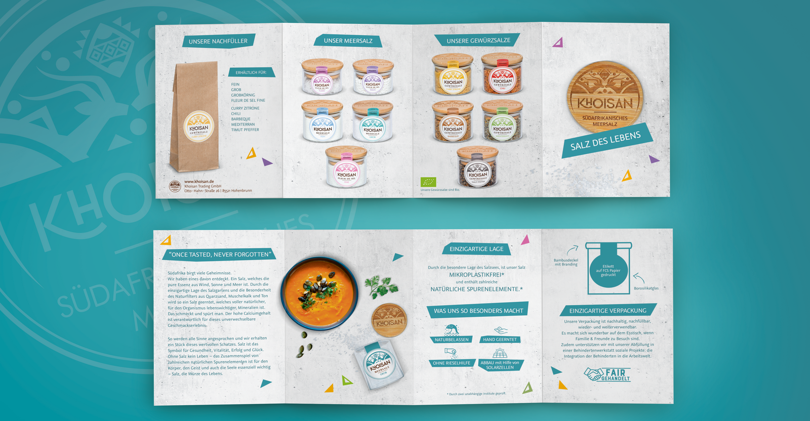
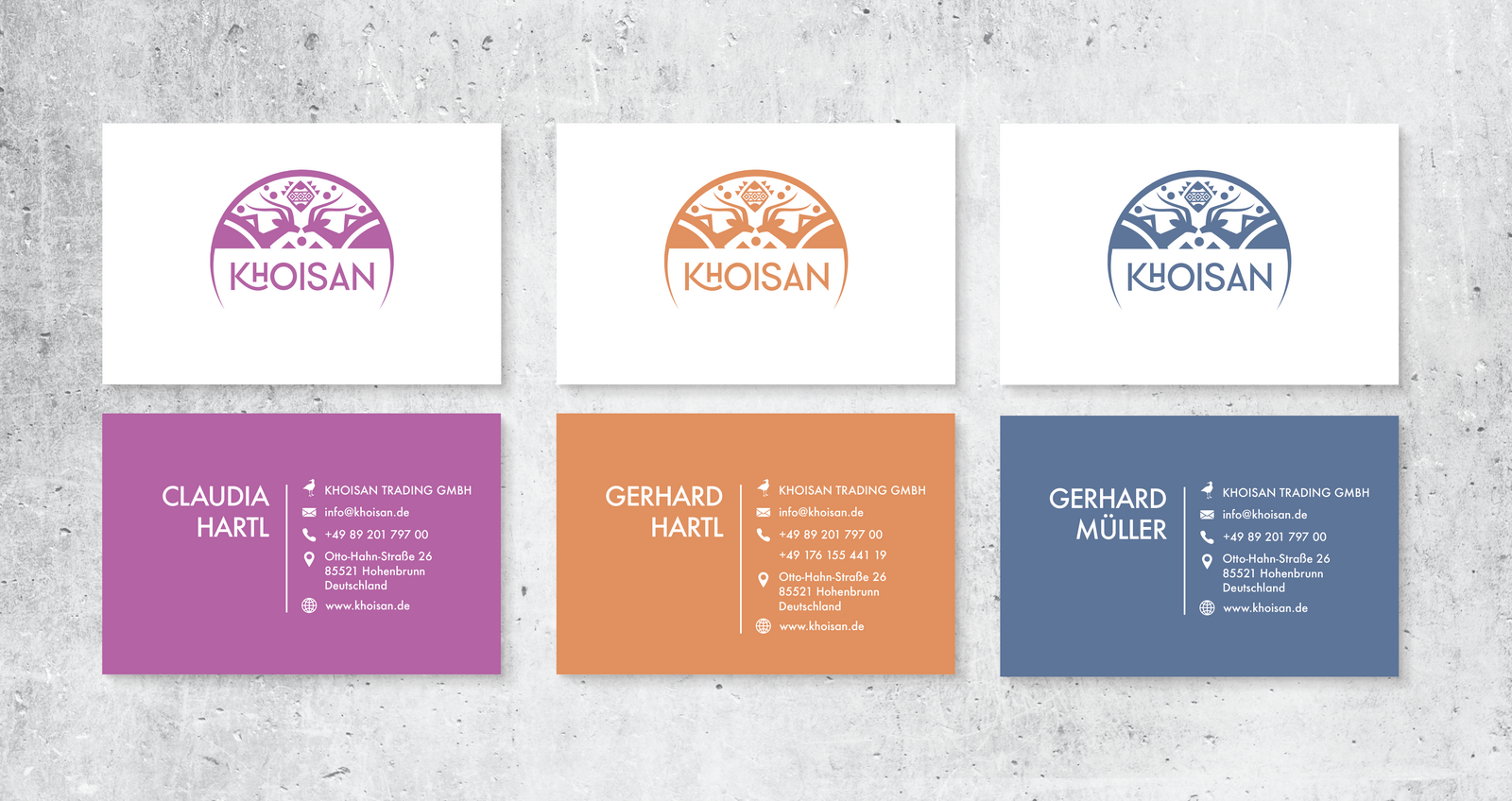
Natural, hand-scooped and microplastic-free sea salt from a South African salt lake ... Such a great product needs the appropriate brand identity and sustainable packaging. The start was the development of a logo that combines the tradition and origin of Africa and the modernity of the product. The logo stands as a central element on the products and provides a strong branding. Through individual color matching, we achieve strong variety differentiation across the entire range, even on a small surface area.
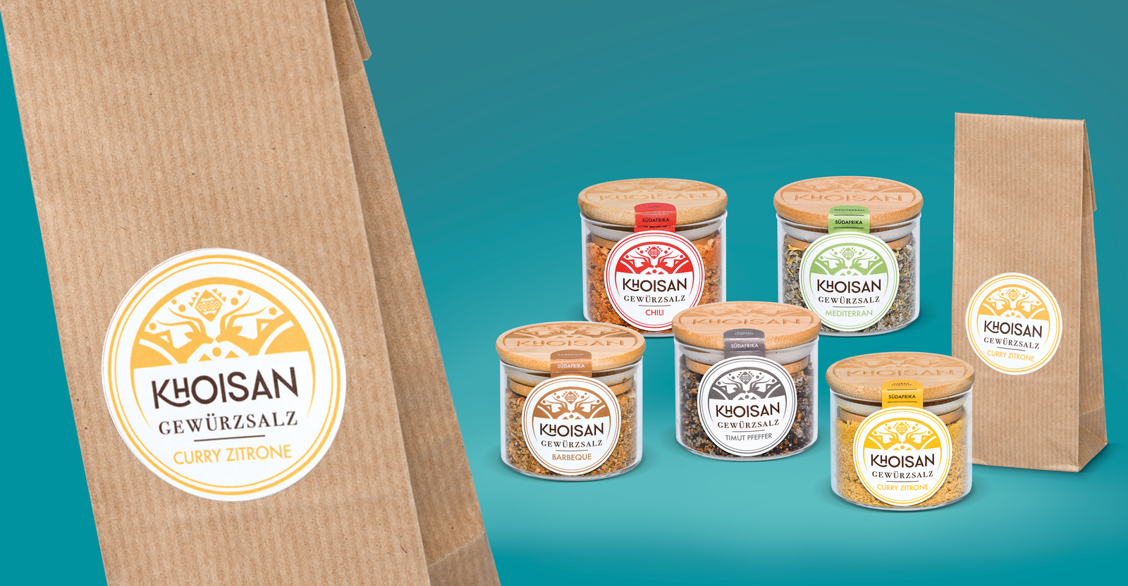
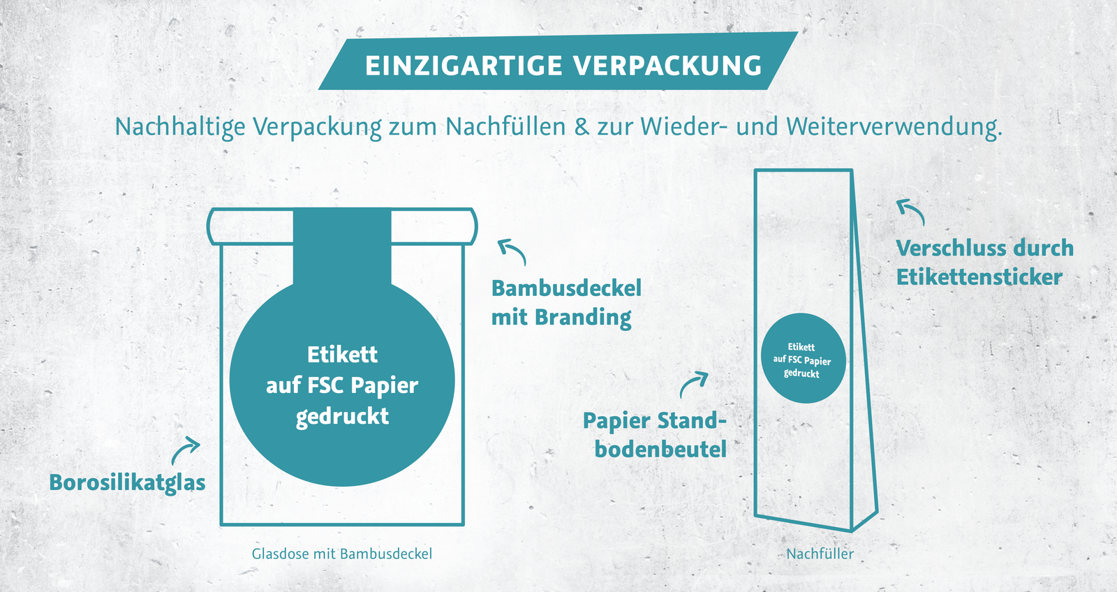
In addition to the 6 salts, the product range also includes 5 salts with spices with the corresponding refill bags. As clear and honest the design is done, as clear and honest is the packaging. A glass jar with branded bamboo lid with a silicone lip and a label printed on FSC paper. Thanks to the refill bag, the glass jar can be easily reused. Thus, the idea could be implemented to use a packaging that lasts a lifetime and thus consumes optimally little energy.
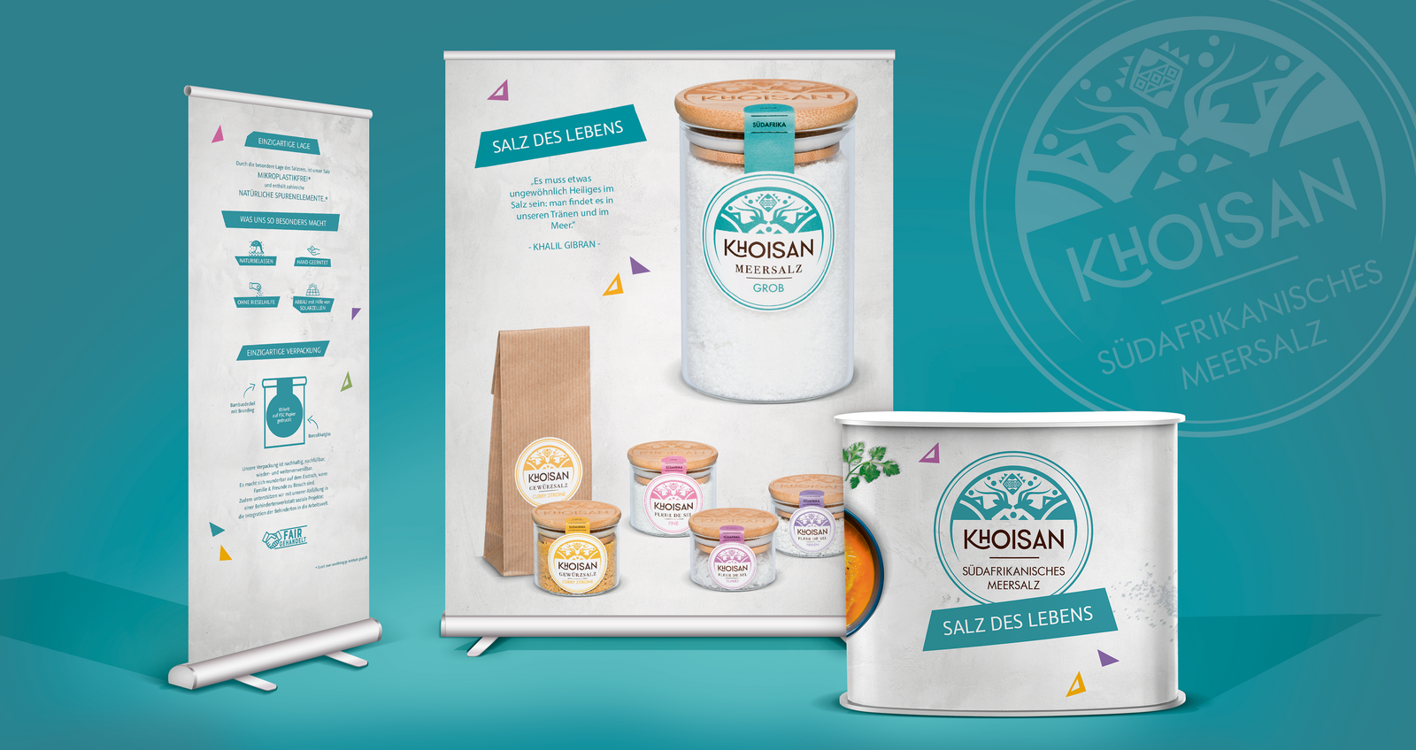
For the holistic brand presence, the corporate branding was also implemented with business stationery, sales material and the trade fair presence at BIOFACH.
The result: an honest and strong brand presence that reflects the product characteristics through its emotional, natural clarity and a packaging material that does not end up in the trash can, but becomes a long-lasting brand ambassador on the kitchen shelf.
